The short version
- Three reports worth writing, with the actual numbers in each.
- Total feedback volume measures the visibility of your form, not the health of your product.
- One table with the right columns produces all three reports.
- A spreadsheet does this. The tool only saves the typing.
The feedback report examples below are all periodic summaries of what people asked for and what happened to it. Most reports are a chart of volume over time, which is the one number in the whole subject that decides nothing.
Three report shapes below, written for this post, with what each one is for. Then the columns you need to build any of them, which is the part that's usually missing.
What should a feedback report contain?
Three things. What people asked for, what you did about it, and what changed since the last report.
The third is the one that makes it a report, not a snapshot. A page of current counts is a dashboard. A report says what moved.
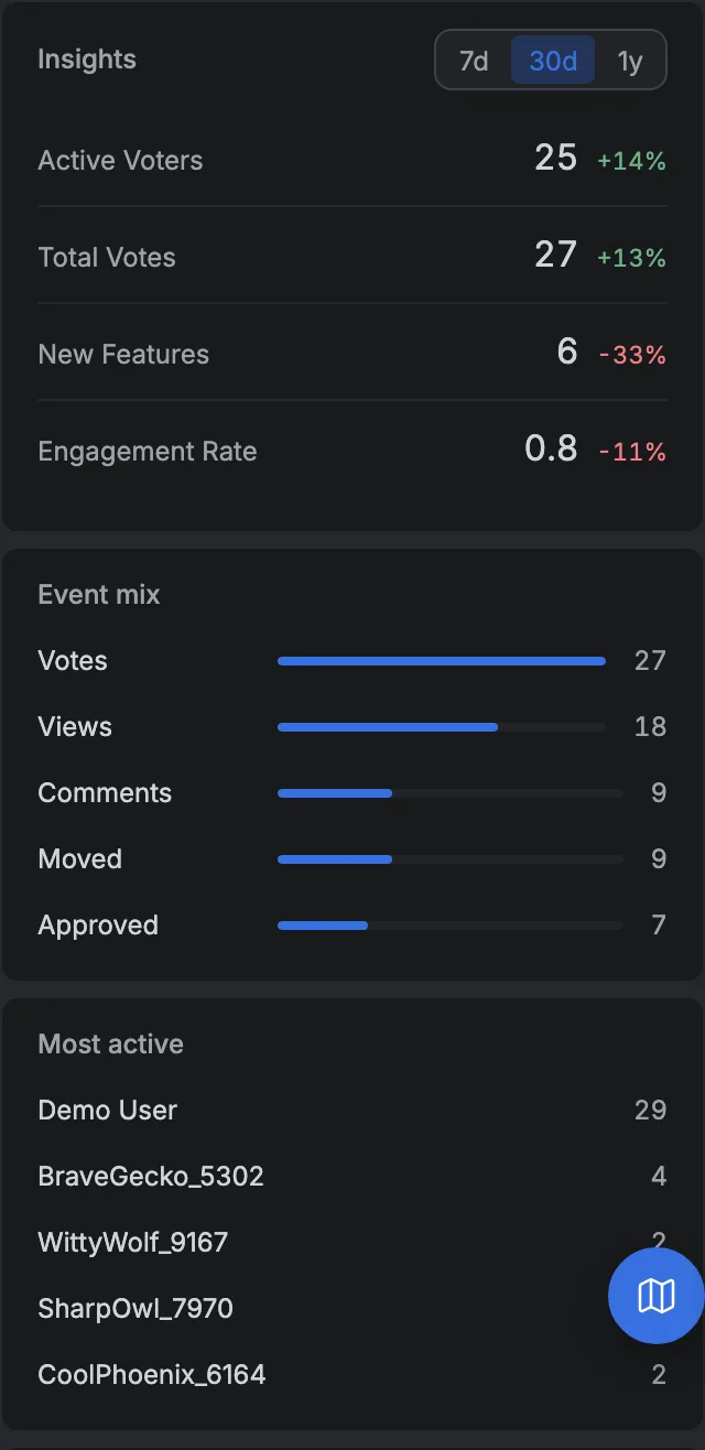
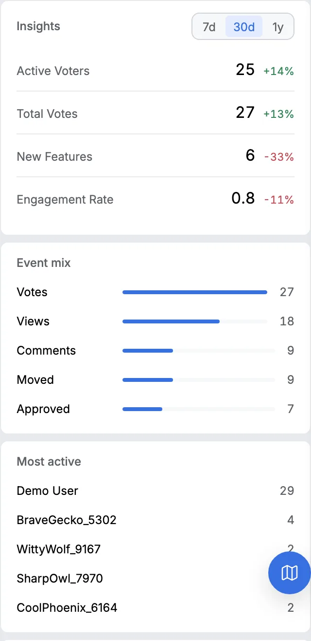
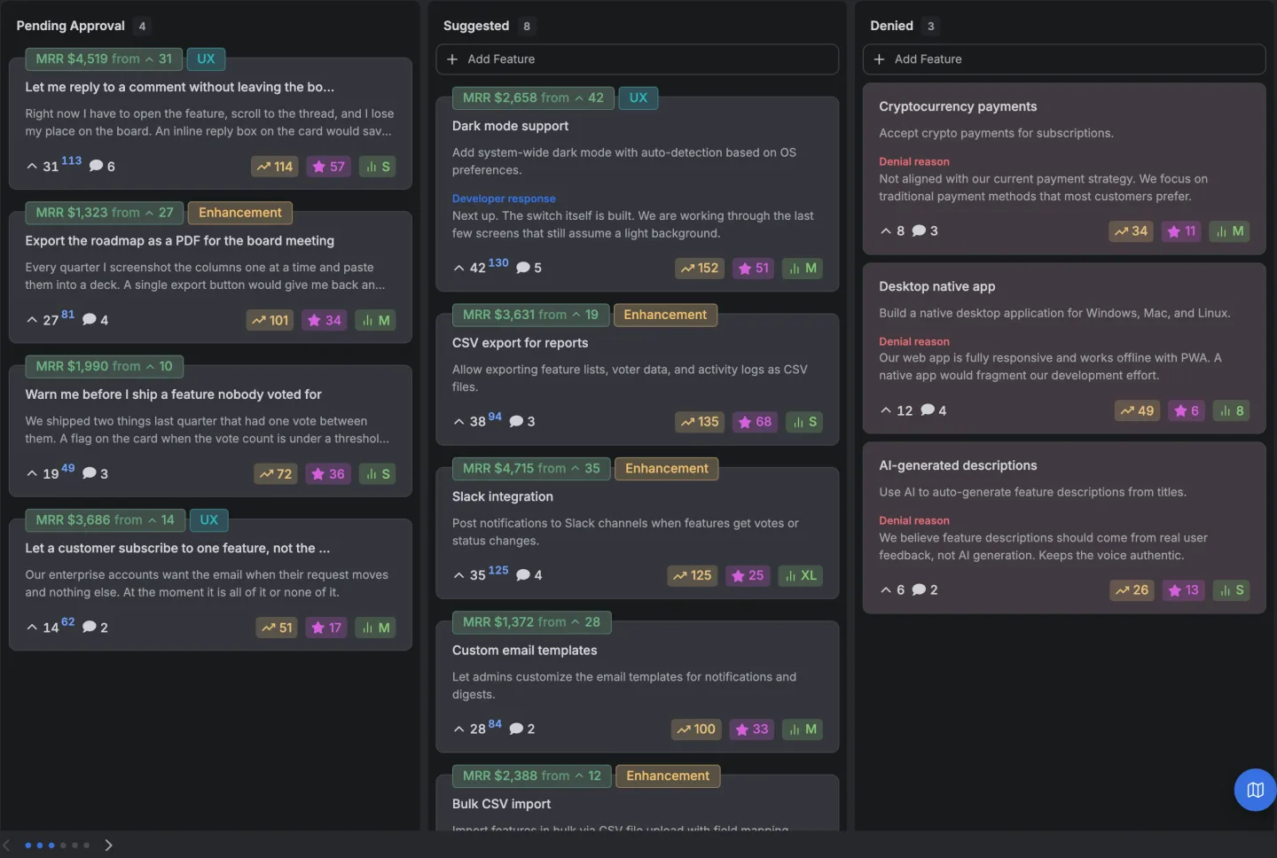
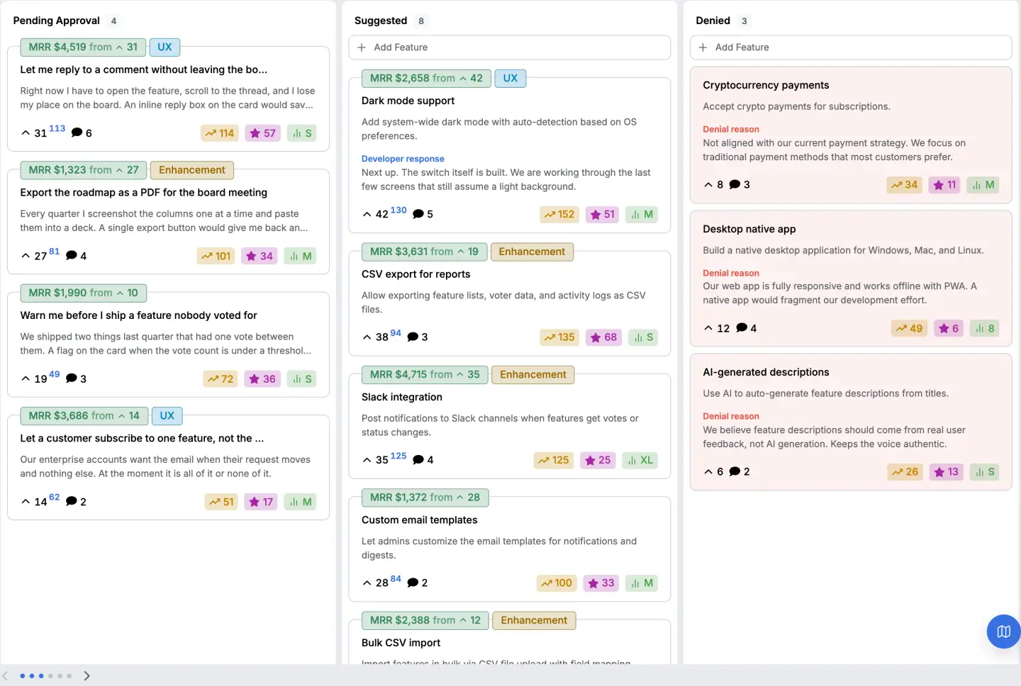
There's a queue with all three available if you want to see where the numbers come from, and the demo is open without an account.
Want the counting done for you? Twenty eight feedback tools, the price and the unit each one bills on, read on one day.
The three shapes
| Shape | Audience | What it answers |
|---|---|---|
| The monthly queue report | The team | What moved, what is stuck, what arrived |
| The account report | One customer, or their account manager | What this account asked for and what happened |
| The board health report | Whoever owns the process | Whether the loop is closing |
The monthly queue report
September

Arrived         34 new requests
Merged          9 into existing ones
Shipped         6, carrying 118 votes between them
Declined        4, each with a reason on the card
Still open      71, of which 12 have been open more than a year

Top three by demand
  Bulk CSV import            84 votes · $12,400 behind it
  Filtering by account       31 votes · $8,900 behind it
  Webhook on status change   47 votes · $3,100 behind it

Oldest open request  Audit log export, 14 months, 29 votes
The two rows that matter are the last two of the first block and the last line. Still open, of which twelve have been open more than a year is the honest measure of whether the queue is a queue or a landfill.
The oldest open request is the same fact with a name on it.
Volume arrived is the number everybody puts first and it's the least useful. It measures how many people wrote, which moves with how visible the form was that month.
The account report
Northwind Systems · $4,200 a month · since March

Asked for      5 requests
Shipped        2  (bulk import, exports over 10k rows)
Planned        1  (filtering by account, currently second)
Declined       1  (native mobile app, the board is readable on a phone)
Open           1  (audit log export, 29 votes, no date)

Last request   6 weeks ago
The most useful report on this page, and the one almost nobody produces.
It exists because the question "what has this customer asked for and what did we do" comes up in every renewal conversation and is normally answered from memory. Five lines, assembled from data you already have, answer it with evidence.
The declined line is the one that makes it credible, not a sales sheet.
The board health report
Requests closed with a reason        87%
Requests open more than a year       12 of 71
Median days from arrival to a state  9
Shipped items announced              6 of 6
Requests with more than one voter    41 of 105
This one is about the process, not the product, and every row is a failure mode written as a number.
The last row is the one worth watching. A board where most requests have exactly one voter is either too new or not visible to the people who would agree, and in both cases the counts on it can't carry an ordering decision yet.
The numbers not worth putting in a report
Total feedback volume. It measures the visibility of your form.
Sentiment as a single score. A number with no sentence attached.
Average time to respond. Easy to game by responding with nothing.
Number of requests closed. Closing isn't a virtue. Closing with a reason is.
The columns you need
Every report above is assembled from one table with these columns, which is the useful thing to check your own tooling against.
| Column | What it is for |
|---|---|
| Heading | The request |
| Description | The situation |
| Developer response | The reason, when declined or answered |
| Status | Which state it is in |
| Votes | The plain count |
| Weighted votes | The count read by revenue |
| Comments | Whether it was argued about |
| Views | How many people saw it |
| Progress | How far through it is |
| Changelog type | Which group it belongs to when it ships |
| Created | The date it arrived |
Our own export writes exactly those, plus the identifier, as a CSV of twelve columns in one header row. Every report on this page can be produced from that file in a spreadsheet, which is deliberate, because a report you can rebuild yourself is a report you can trust.
How do you do this without a tool?
A spreadsheet with the columns above, filled in as requests arrive, and a monthly tab that counts them.
The columns that are hard to fill in by hand are votes and weighted votes, because they need the people who agreed to have been able to say so, and the date a request changed state, because it has to be recorded at the moment, not reconstructed.
How does this product do it?
The export is a CSV with twelve columns, being identifier, heading, description, developer response, status, votes, weighted votes, comments, views, progress, changelog type and created date. The weighted count reads the revenue behind the voters, not their number.
Declined requests keep their reason on the card as the developer response, so the percentage closed with a reason in the health report above is a real column, not an estimate.
The feedback board page covers the board, and feedback loop examples covers the return trip these reports measure.
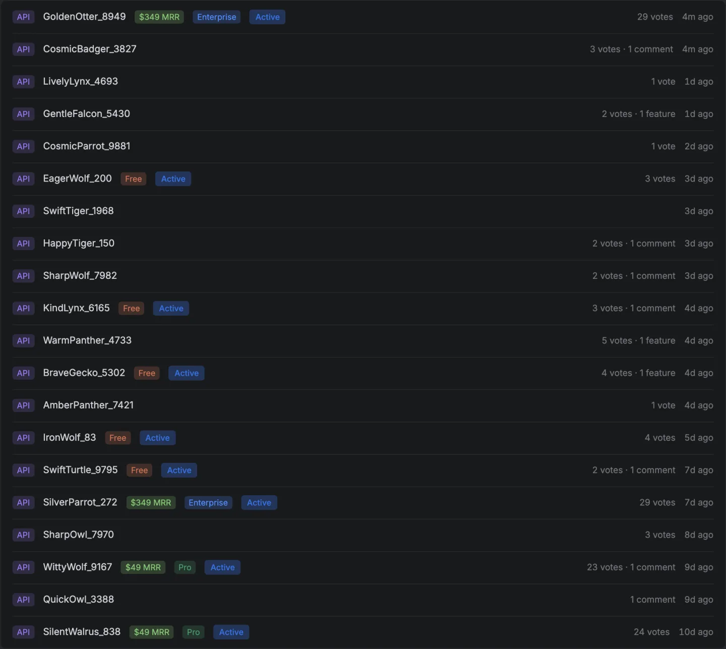
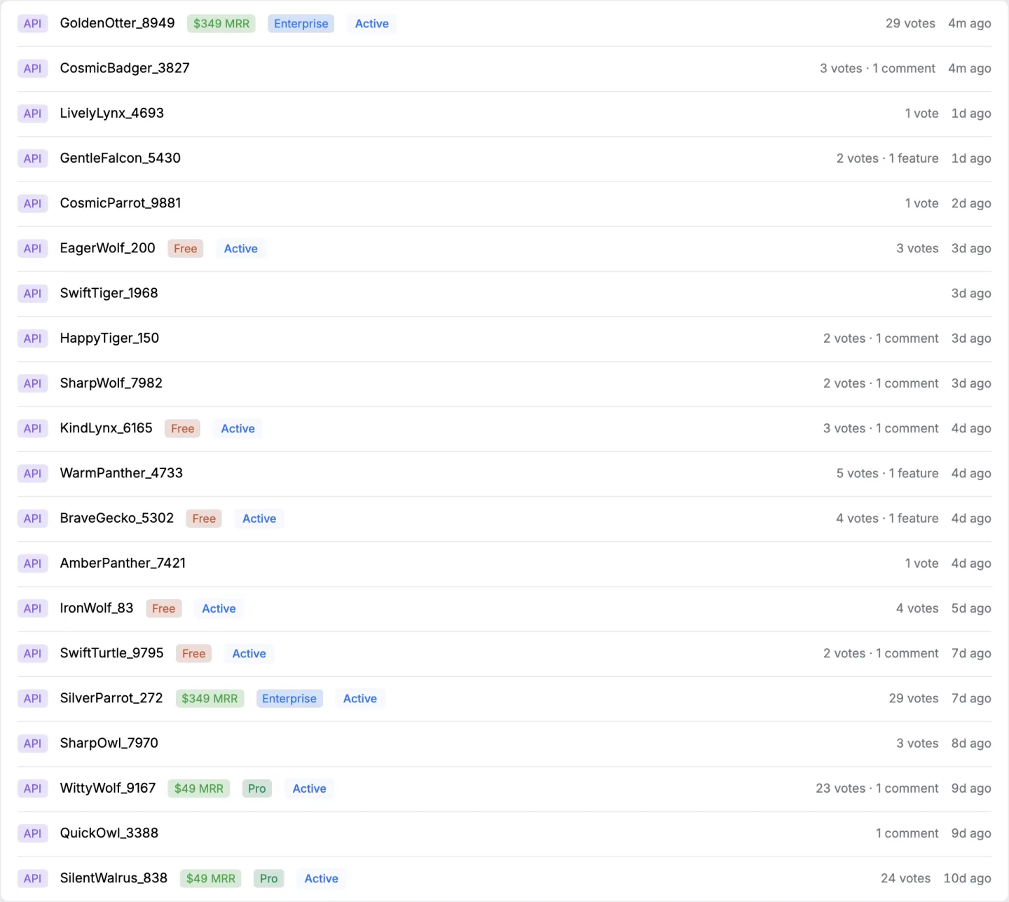
The API returns the same rows if you would rather build the report yourself.
14 days, a card at signup, then $9 or $39 a month.

