The short version
- The same release needs two notes: one for the store, one for inside the app.
- The store field gets cut at about 250 characters, so put the change in the first line.
- A release with nothing in it for users deserves no note. Skip it.
- The people who voted for the thing that shipped should hear from you directly.
Every app release notes example below has to work in two places at once, and the two places want opposite things. The store listing wants a summary for somebody deciding whether to install. The note inside the application wants a specific message for somebody who already uses it.
Most teams write one and paste it into both, which is why so many of them read like bug fixes and performance improvements.
What does a good app release note look like?
Here's one release, written twice, for the two places it has to live.
In the store listing
Boards now open on the tag you were last looking at, so the list you use every day is the list you land on. Filtering is faster on large boards, and the sort no longer resets when you clear a filter.
Inside the application
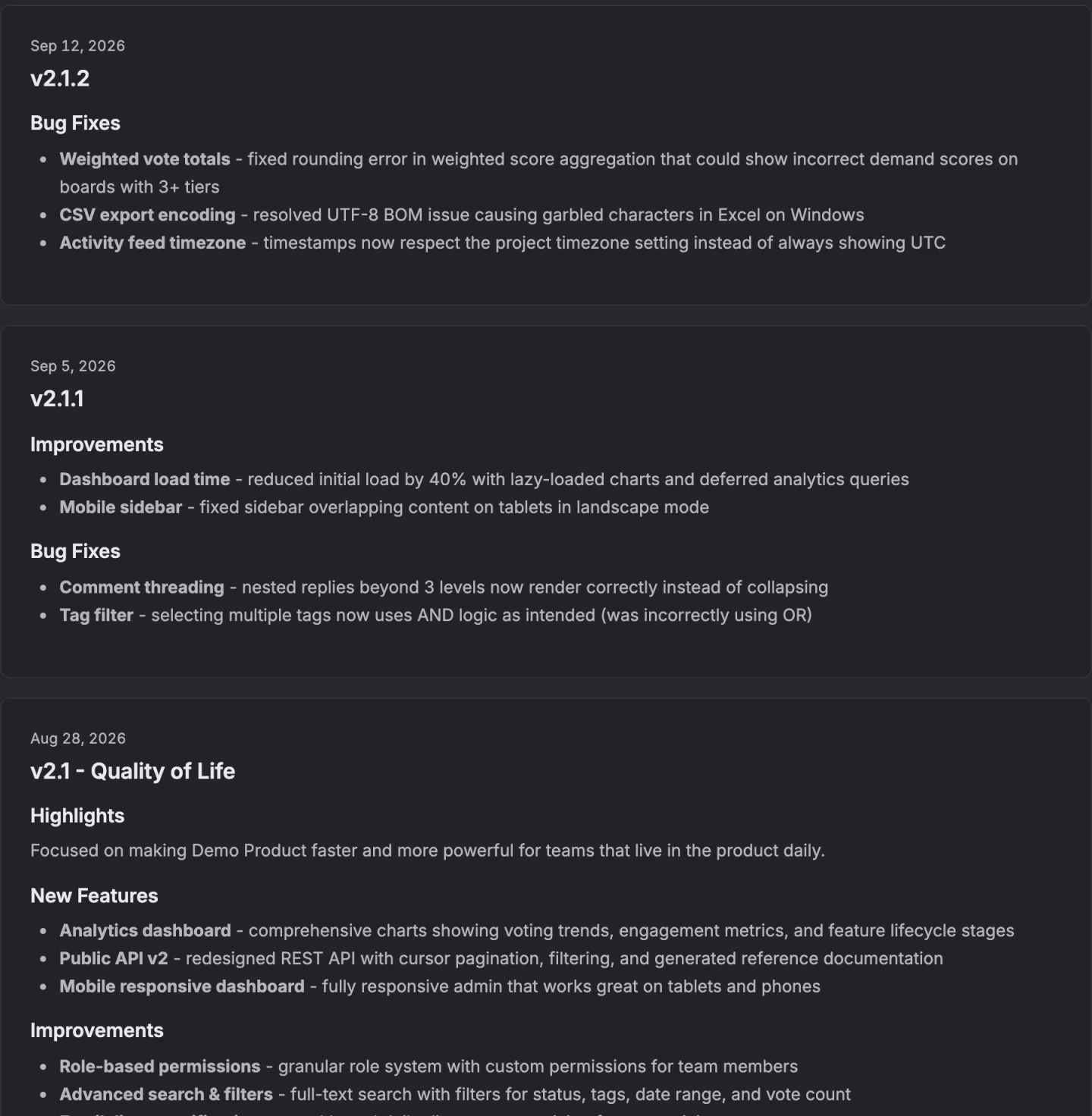
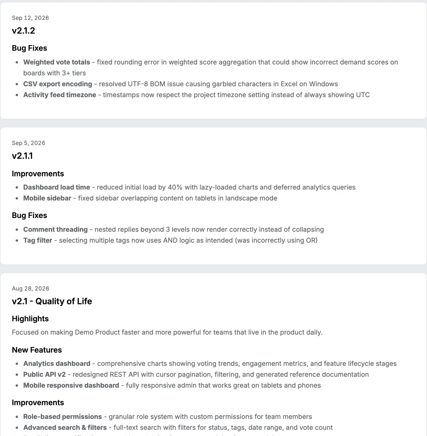
Added. Tag filtering on every board. The filter is part of the address, so a filtered board can be shared as a link. Improved. Boards over five hundred requests open in about half the time. Fixed. Clearing a filter no longer resets the sort order.
You voted for tag filtering in March. Here is the request, with the discussion that shaped it.
The store version is one paragraph and names the benefit. The in application version is three fragments and a link, because the reader is already inside the thing and wants to know exactly what moved.
Want these published and delivered rather than written and forgotten? Ten changelog tools, checked on their own sites for email, a feed and a widget.
Why does the store version have to be different?
Because the reader hasn't used the application yet, and because the field is truncated.
A store listing shows the first line or two of the release note before anything is expanded, and most readers never expand it. Whatever matters has to be in the first sentence. Categories, versions and fix lists all fail there, not because they're wrong but because they're invisible.
The second difference is the audience. Somebody reading the store listing is deciding, and a list of fixes to features they have never seen tells them nothing. One sentence naming what the application now does is worth more than twelve lines of accuracy nobody will read.
What does the in application version get right?
It's written for somebody who can act on it immediately, so it's allowed to be specific.
Three fragments beat three sentences. Added, improved and fixed carry the category, which means the reader can skip two thirds of it and lose nothing.
Naming the request the user voted for turns a list of changes into an answer to something they personally asked. The categories, and which audience each one is for, are set out separately. The full glossary holds the rest of the vocabulary.
The link back to the original request matters more in an application than anywhere else, because the discussion that shaped the feature is the fastest way to explain why it works the way it does.
How do you put a changelog inside an application?
Two ways here, and which one you use depends on what the application is written in.
For anything on the web, the embed script draws the changelog wherever you put it, including as a panel behind a button in your own interface. It takes the colours from your board and the wording is yours to override. The changelog widget is written up with the markup it needs.
For an application built with SwiftUI, the Swift package draws the same changelog natively rather than in a web view, which matters because a web view inside a native application is visible to everybody who uses one. Both read the same board, so a release published once appears in both places.
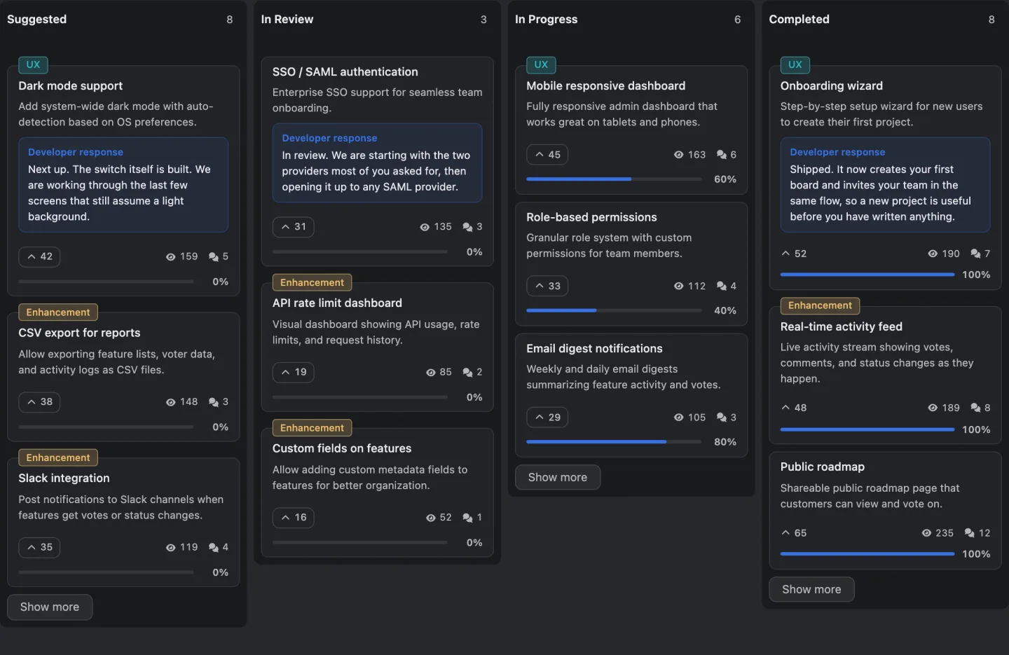
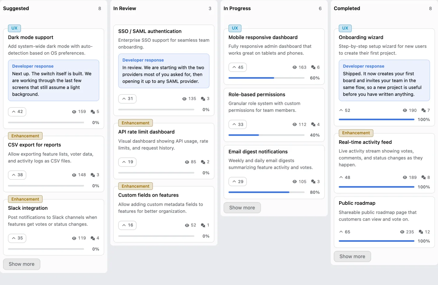
The point of either is that the release note stops being a document somebody remembers to update. It's the same set of completed requests your customers have been watching on the public board.
What about the release note that has nothing in it?
Write nothing, and let the gap show.
An application that ships a release every two weeks and describes all of them as bug fixes and performance improvements has told its users that reading release notes is a waste of time. Once that's learned it's not unlearned, and the next genuinely interesting release is read by nobody.
The version that works is uneven on purpose. A release with something in it gets a real note. A release with nothing a customer would notice gets a single honest line or no note at all. What belongs in a release note and what doesn't is written up separately.
Who should be told directly?
The people who voted for what's in the release, and they're already a list.
An application release reaches everybody through the store and nobody in particular. A message to the eleven people who asked for the thing that just shipped is a different event, it's opened at a rate no broadcast matches, and it's what teaches somebody that filing a request here was worth the trouble.
How that email is written, and who it goes to, is on its own page.
The template for the general version, the one that goes out to everybody, is on this site as a file you can take. It's here, with the categories already in it.
14 days, a card at signup, then $9 or $39 a month.