The short version
- A matrix scatters requests on two axes so the top left and bottom right become obvious.
- Demand against effort is the pair worth using, because both can be counted.
- Urgency against importance produces a picture, because neither axis has a unit.
- If both axes are counted, the matrix draws itself and the meeting is about exceptions.
A prioritisation matrix is two axes and four quadrants. Its job is to make a decision visible, and most of them make a picture instead.
The difference is entirely in the axes. Two of the common pairs produce an answer you can act on and the rest produce a diagram somebody screenshots for a deck.
What is a prioritisation matrix?
A scatter of your requests on two dimensions, divided into four quadrants, so that the top left and bottom right become obvious.
The mechanism is real and it's simple. Humans compare two things well and five things badly. Reducing a request list to two numbers and a position lets a room agree about the extremes in about ten minutes, which is faster than any scoring exercise.
There's a queue carrying two usable axes if you want to see them, and the demo is open without an account.
Doing this in a tool rather than a spreadsheet? Twenty one feature request tools and the eight units they bill on. The unit decides the bill, not the headline price.
Which axes produce a decision
| The pair | What the quadrants mean | Does it decide anything? |
|---|---|---|
| Value against effort | Do the cheap valuable things first | Yes, and it is the default for a reason |
| Demand against effort | Do the wanted cheap things first | Yes, and the inputs are easier to get honestly |
| Reach against impact | A picture of your user base | No. There is no effort term, so nothing is refused |
| Urgency against importance | A picture of your calendar | No. Both axes are opinions with no unit |
| Confidence against value | A picture of your uncertainty | No, but it is a useful second pass over one quadrant |
| Cost against risk | Useful for a decision about infrastructure | Sometimes, and rarely for a request list |
The pattern is the same in every row. A matrix decides something only when one of its axes is a cost. Without a cost axis, nothing is ever in the bad quadrant, because every request is valuable to somebody and the picture just shows you the spread.
Value against effort
The default pair, and the one most people mean.
Value is the hard half. It's usually estimated, and an estimated value is where the room's opinions enter through a number, not a sentence, which is worse because it looks measured.
The version that survives scrutiny replaces estimated value with something counted. Revenue behind the request is the strongest available, because it's a number somebody could check afterwards.
Demand against effort
The pair worth using on a request list, because both axes can be counted, not estimated.
Demand is how many people asked, or better, how much the people who asked are worth. Effort is your own estimate, which is the only guess left in the exercise.
These are the quadrants.
| Low effort | High effort | |
|---|---|---|
| High demand | Do these now | Plan these properly |
| Low demand | Do these when convenient | Refuse these, in writing |
The bottom right is the entire value of the matrix. It's the quadrant nobody wants to name out loud, and putting things in it visibly is the only output of the exercise that shortens the list.
The axes that produce a picture
Urgency against importance. Both are opinions, neither has a unit, and everything a stakeholder brings arrives already labelled urgent and important. The matrix ends up with everything in one corner.
Reach against impact. Fine as an input to a score, useless as a matrix, because with no cost term the bottom left is the only thing ever refused and the bottom left is usually empty.
What a matrix cannot do
Order within a quadrant. Seven things in the top left aren't ordered by being there, and you still have to pick one for Monday.
Handle dependencies. A cheap low demand item that three expensive items require is in the wrong quadrant and the matrix has no way to say so.
Survive the room. The position of a dot is set by whoever is most confident about the estimate. The fix is to use counted axes, which is the same recommendation as everywhere else in this cluster.
The version that needs no meeting
If both axes are counted, not estimated, the matrix draws itself and the meeting is about the exceptions rather than about the placement.
Demand comes off a request list if the people who want a thing can say so. Effort is one number per card, added when the card is looked at. With those two, the ordering is a sort, not a workshop, and the discussion starts from a position nobody has to defend socially.
How do you do this without a tool?
A spreadsheet with two numeric columns and a scatter chart. Label the quadrants and put a name in the bottom right on purpose.
The hard column is demand, because without somewhere for users to agree with a request, it's your own estimate of how many people care, and then both axes are opinions again.
How does this product do it?
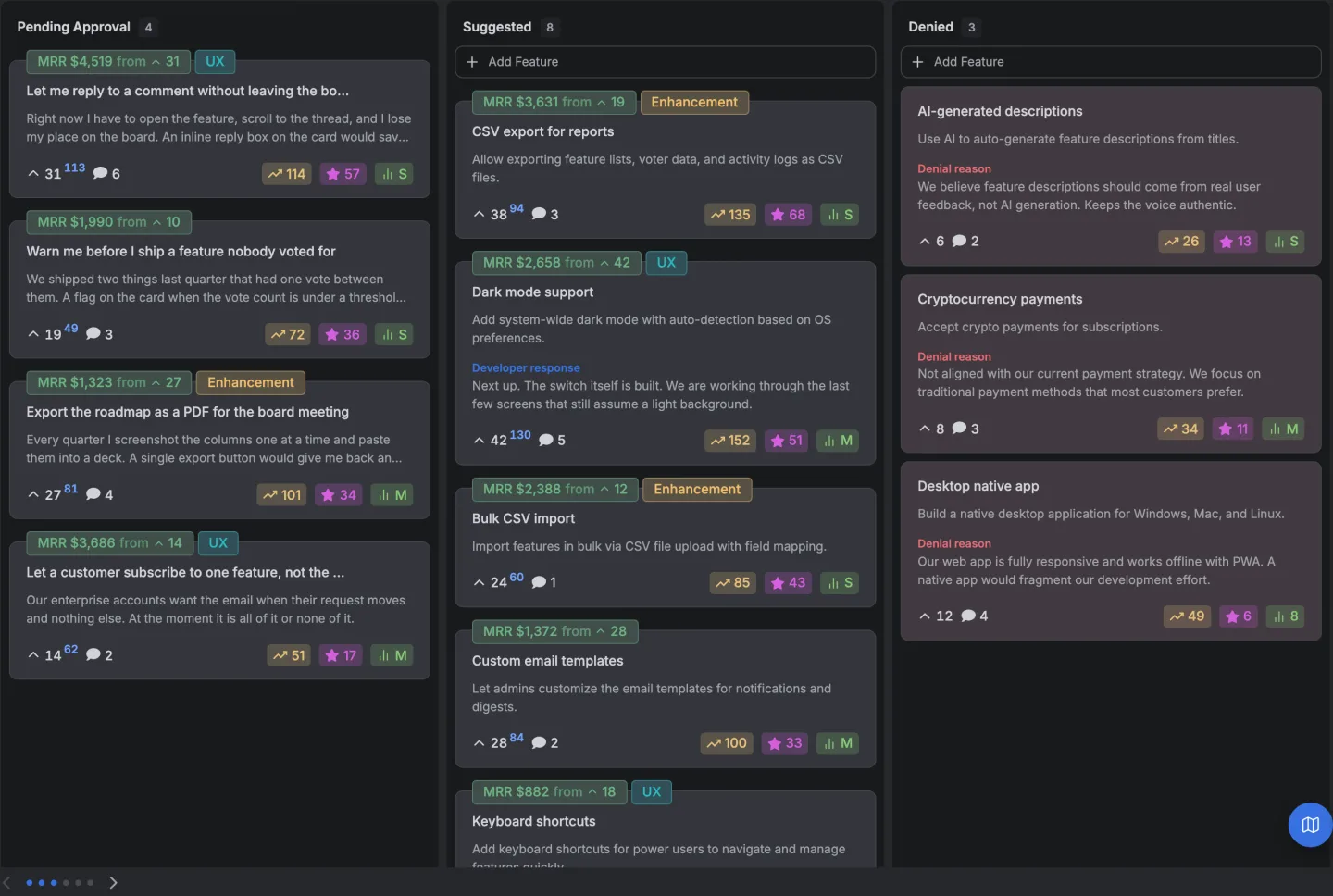
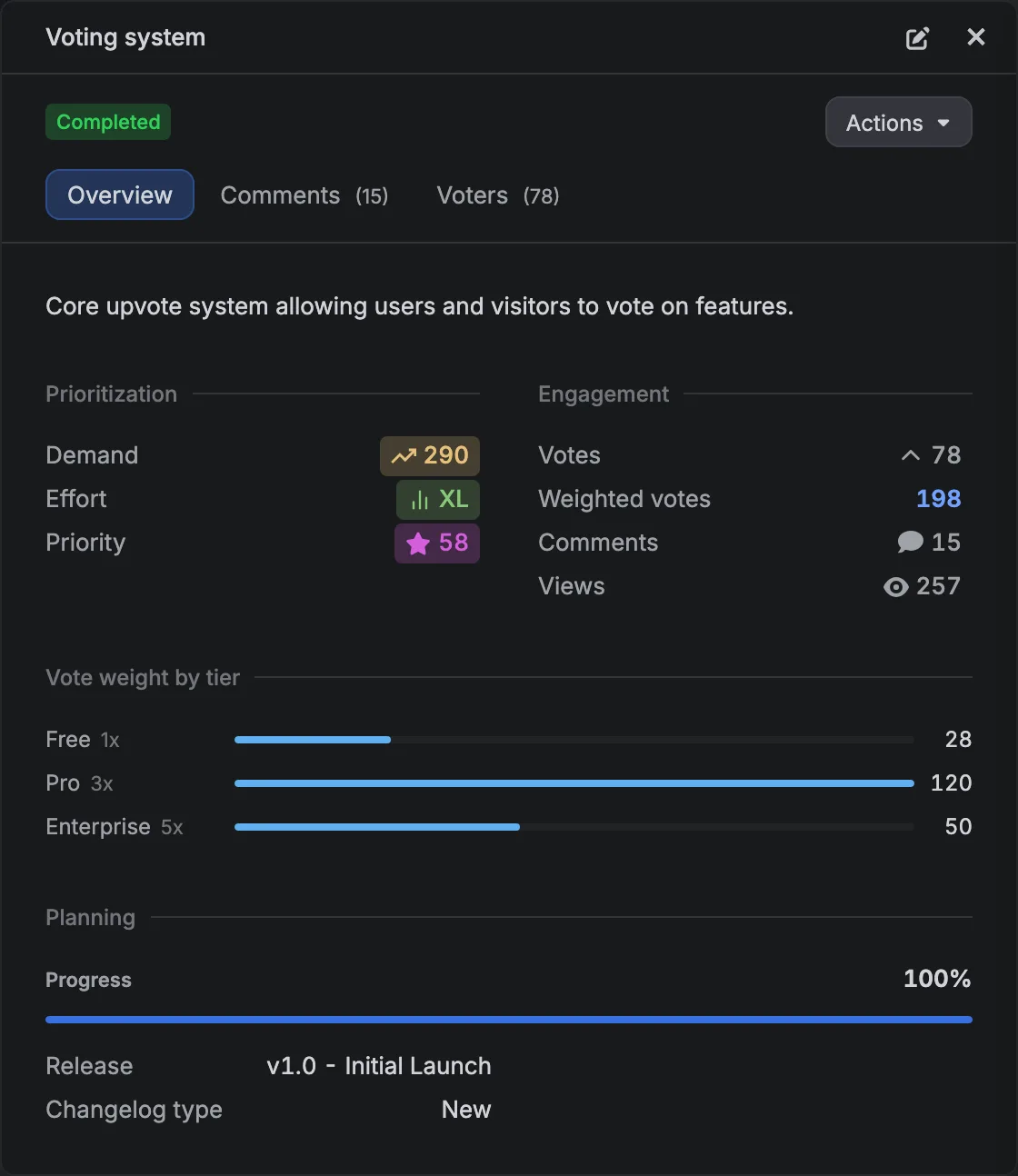
Each card carries a demand score computed from the votes, comments and views on the request, and an effort estimate you set. The board can be sorted by the priority those two produce, which is the demand against effort matrix read as a list.
The demand half is counted, not estimated, because the request carries the people who voted for it, and those people carry whatever you know about them including the revenue behind the account. The weighted count sits beside the plain one, so the vertical axis can be people or money.
Denied is one of the five default columns with the reason on the card, which is the bottom right quadrant made permanent and visible to the person who asked.
The revenue weighted voting page covers the weighting.
What a prioritisation framework does covers the five rules a matrix is one of, and a worked RICE list shows the arithmetic version of the same decision.
14 days, a card at signup, then $9 or $39 a month.