The short version
- Twelve forms, from one box to far too many, with what each one costs you in answers.
- Two fields earn their place. Three if you intend to reply.
- Requiring an account is the most expensive field on the form, and it doesn't look like a field.
- Say what happens next, in one sentence, before the person leaves the page.
A customer feedback form is the box a customer fills in to tell you something about your product, and the examples below are all of that one kind.
Not a review form, not an employee survey, not a satisfaction score you email out after a support ticket. A box, on a page, that a person types into because they want something and you're the person who could build it.
Almost every form of this kind is too long, and the length isn't a style problem. Each field you add removes some of the people who would have written to you, and the ones it removes aren't random. It removes the busy ones first, and the busy ones are usually the ones paying.
So this post is mostly about subtraction. Twelve shapes below, from a single box to a full intake, and then the four questions worth keeping.
Every form and every example on this page was written for the post. None of them is a real form belonging to a real company, because reproducing somebody's product to make a point about it's their decision, not ours.
What is a customer feedback form actually for?
To turn something a person already thinks into a row you can count.
That's narrower than it sounds and it rules a lot of things out. A form isn't for qualifying leads. It's not for routing tickets, and not for collecting a mailing list either.
Every time somebody adds an email field to a feedback form for a reason unrelated to feedback, the form gets a little worse at the only job it has.
The row it produces has to survive on its own. In four months, with thirty votes on it, somebody has to be able to read it and know what was being asked for. That's the whole quality bar, and most fields on most forms do nothing to help a row clear it.
There's a second job, and it's the one people forget. A form has to end in a way that tells the person what happens next. A form that swallows the answer and says thank you has taught somebody that writing to you does nothing, and that lesson is expensive because it's permanent.
The examples below all exist on a demo board that's open without an account.
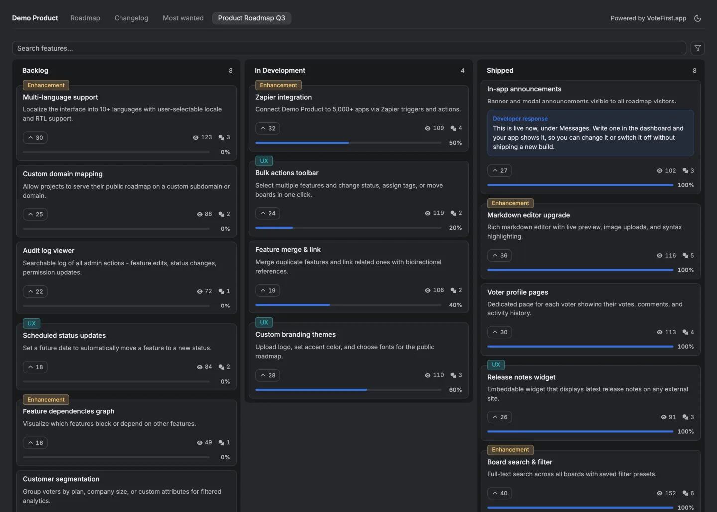
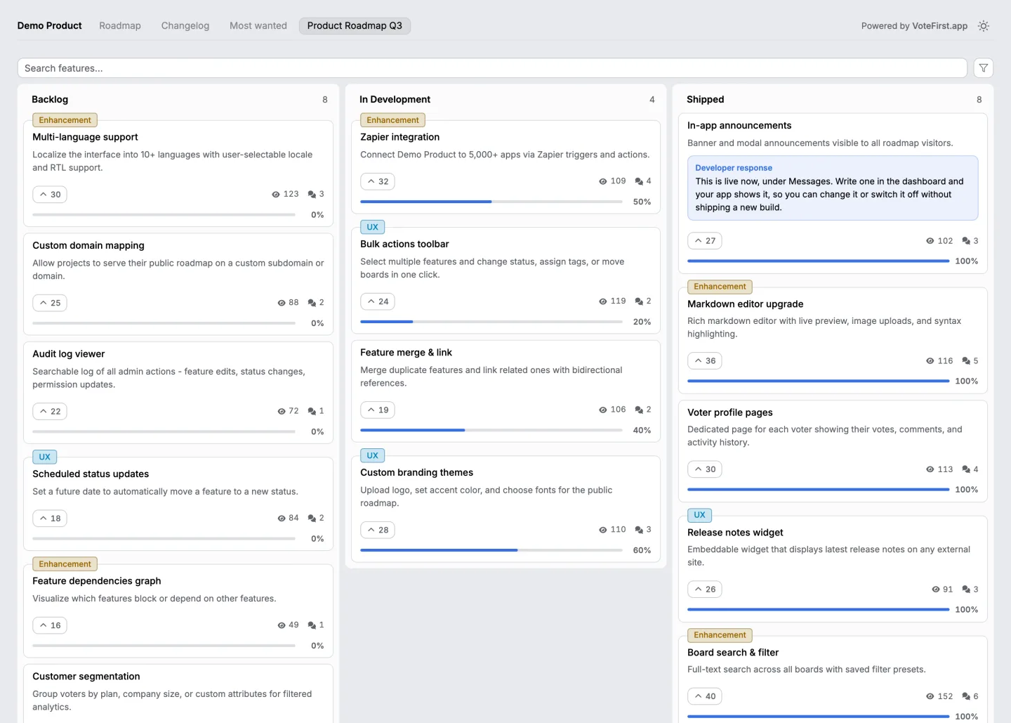
Want the form to feed a board people can vote on? Twenty eight feedback tools, the price and the unit each one bills on, read on one day.
Twelve forms, from one box to too many
Same product, twelve shapes, in rough order of how much they ask.
| The form | What it buys and what it costs |
|---|---|
| One box, no label, Tell us what you think | The most answers and the least usable ones. You get moods, not requests, and half of them are support questions |
| One box with a real prompt, What is missing | A large improvement for no extra work. The prompt does the job the missing fields were meant to do |
| Title and description, both required | The shape most boards use. Enough to be countable, short enough that nobody abandons it |
| Title, description, optional email | The email is the only field worth adding, and only if you will actually write back |
| Title, description, required email | Now you have a gate. Everybody who was going to tell you something in passing has gone |
| Title, description, category dropdown | You are asking the customer to file it. They will get it wrong, and you will re sort it anyway |
| Title, description, priority selector | Worse than useless. Everything is urgent to the person typing, so the column carries no information |
| Title, description, email, company | Fine on an internal form for your own account managers. On a public page it reads as qualification |
| A star rating and a comment box | Two different instruments in one form. The rating is a satisfaction measure and the comment is a request |
| Rating, category, comment, email, name | The compromise form, which is the worst of all of them. Long enough to lose people, vague enough to be unrankable |
| Eleven fields on a full intake page | Answers only from people paid to fill it in. Excellent for internal use, empty in public |
| A survey with branching logic | A different tool for a different question. Nothing wrong with it, but it is not a feedback form |
The pattern down that table isn't length exactly. It's whether each field changes what you would do. A field that doesn't change a decision is a field you're asking a stranger to fill in for your convenience.
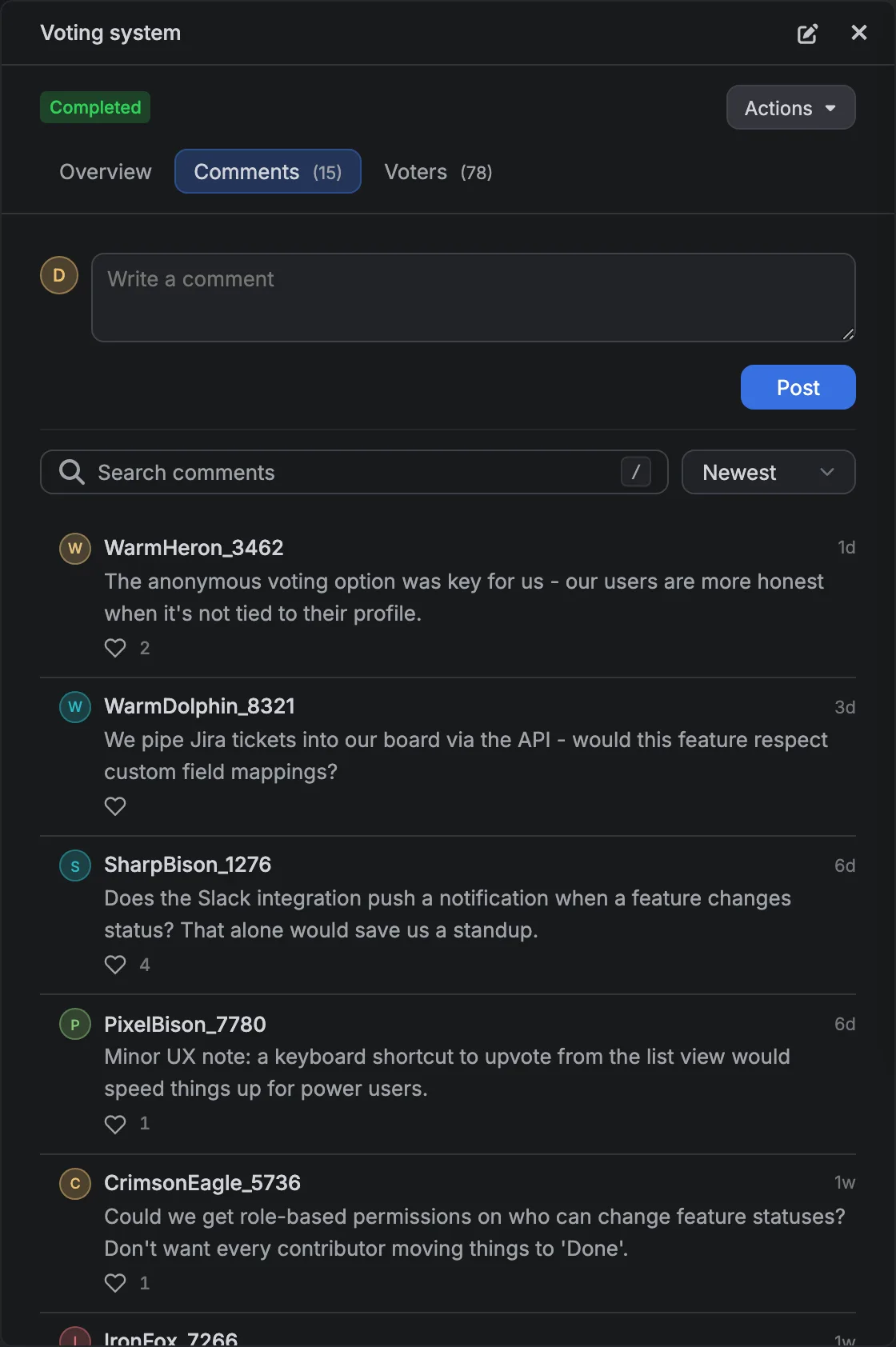
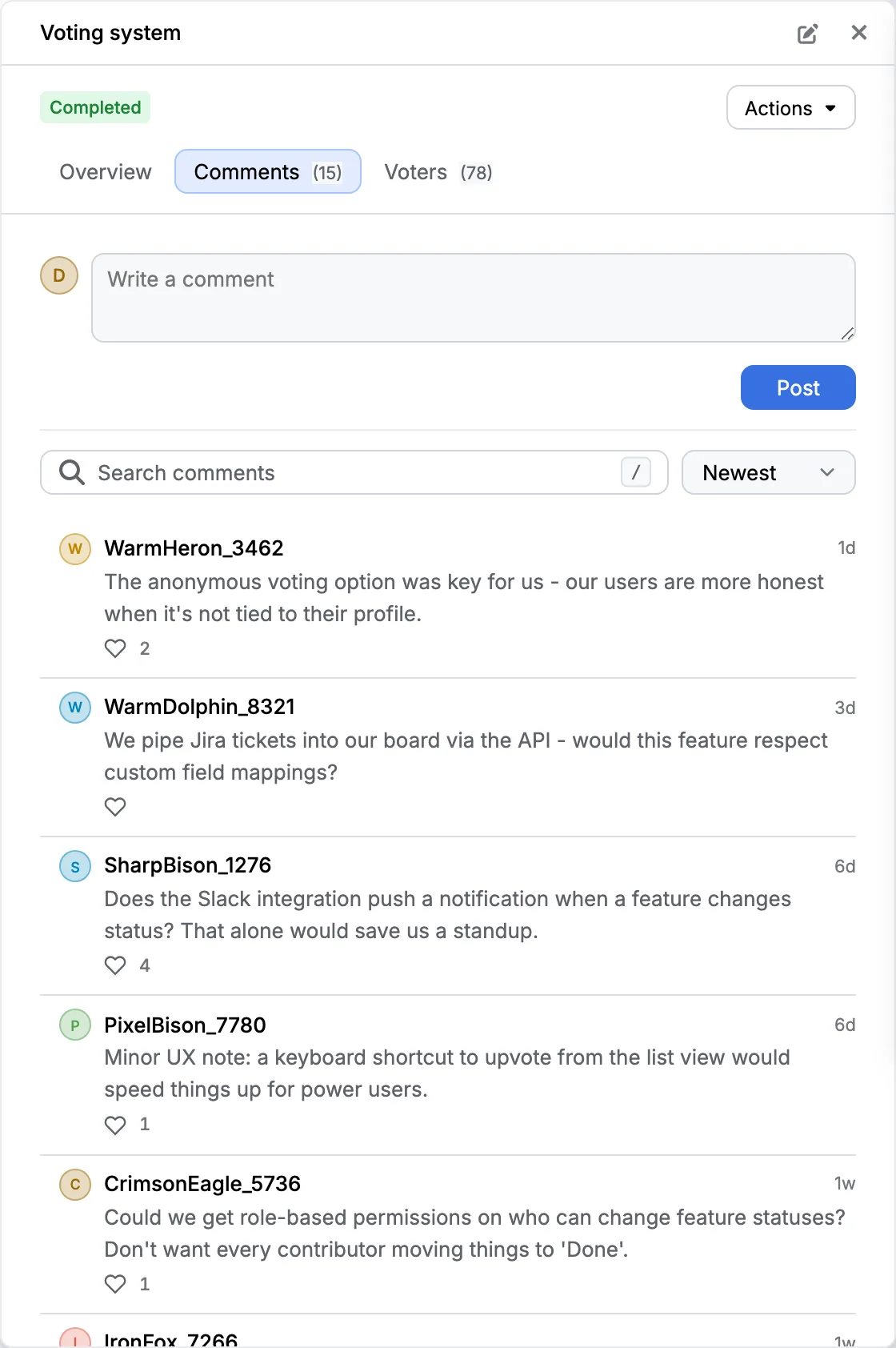
Which fields actually earn their place?
Two, or three if you intend to answer.
A title. One line, in the customer's own words, that another person could search for. This is the field that makes the row countable, because two people describing the same difficulty in a title will usually collide, and two people describing it in a paragraph almost never will.
A description. Room to say what's difficult, when it happens and what they do instead today. That third part is the valuable one and no form gets it unless the placeholder asks for it directly.
An email, optional. Worth having only if somebody will write back. An optional email on a form nobody answers is a field that collects addresses under false pretences, and people can tell.
Everything else is a field you're adding because it would be convenient to have it, and convenience for you is paid for in answers from other people.
Why does every extra field cost you answers?
Because filling in a form is voluntary, and the decision to stop is made in the first two seconds.
A person arriving at a form is doing a quick and unconscious sum. They compare the effort in front of them with the chance that anything comes of it.
A short form with a clear promise wins that sum. A long form with a vague promise loses it, and the person who loses it doesn't tell you they left.
The bias this creates is the important part. Length doesn't filter out the frivolous. It filters out the busy, and the busy are disproportionately the people running the accounts you care about most. The person with an afternoon free will fill in eleven fields. The person with a renewal next month won't.
So the shape of your form decides the shape of your sample, and the sample is what every feedback number is whether or not anybody says so out loud. A form isn't a neutral collection instrument. It's a filter you designed, usually by accident.
Which feedback questions are worth asking, and what do the examples look like?
Three on the form itself, and a fourth you should already know the answer to. Each one is written out below in the words a form would use.
What's difficult. Not what feature they want. The difficulty is the thing that stays true even if your solution turns out to be different from theirs.
When does it happen. Once a quarter and ten times a day are different problems with the same title, and nothing else on the form separates them.
What do you do instead today. The workaround is evidence. Somebody who exports a spreadsheet every month has proved the problem is worth twenty minutes to them, and somebody with no workaround has usually not hit it yet.
Who asked. This is the fourth and it doesn't belong on the form as a question. It belongs in whatever your form is attached to, either because the person is signed in or because you've an optional address. A request you can't attribute is still countable, and it's one you can never follow up.
If you want those three questions written out as an actual file rather than as advice, there's a template on this site in plain Markdown and as a GitHub issue form, and it's free to copy with nothing in front of it.
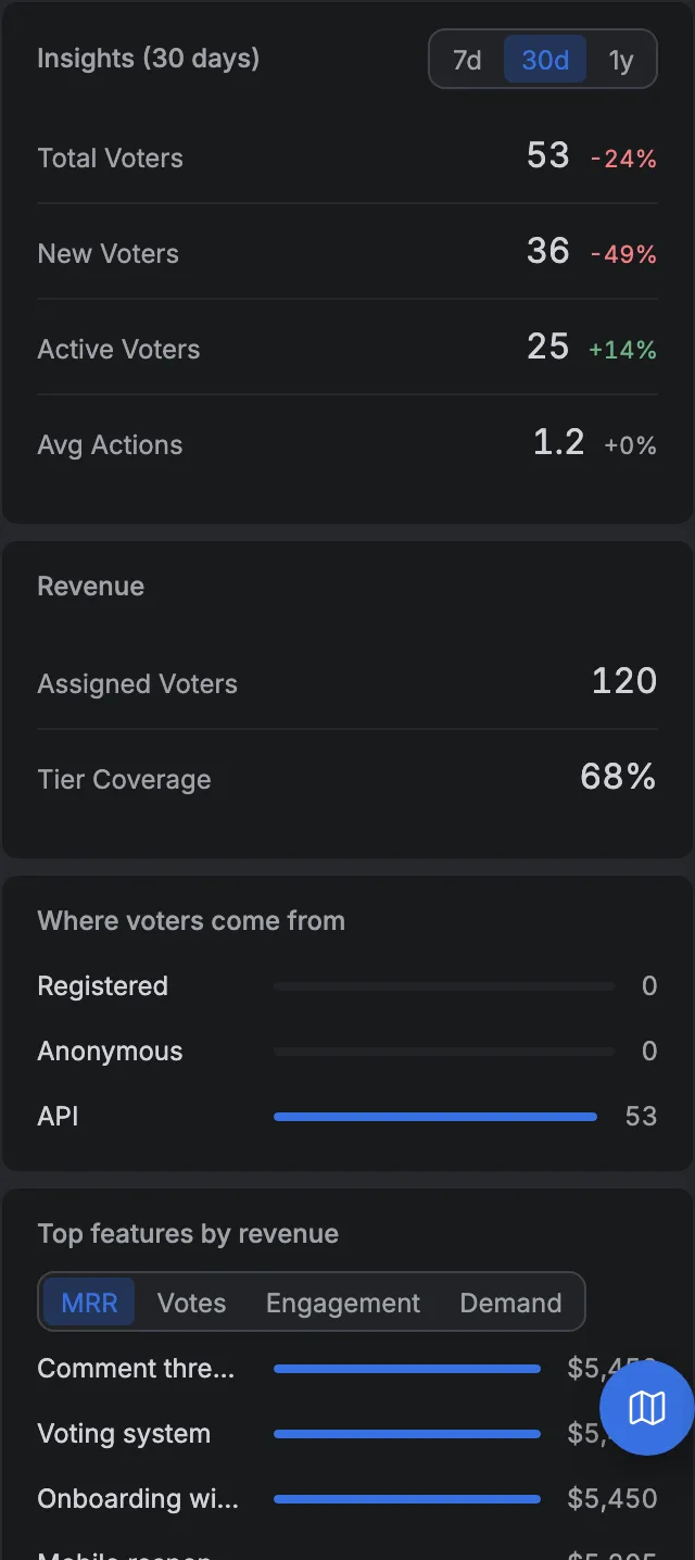
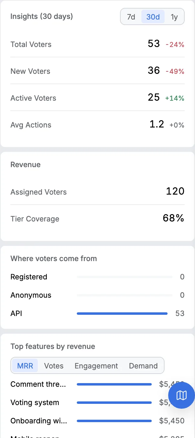
What should a form do after somebody presses send?
Say what happens next, in one sentence, before the person leaves the page.
Three things belong in that sentence. Whether a human will read it. Roughly when. And whether the thing they wrote will appear anywhere public, because a person who has just typed a complaint has a legitimate interest in knowing it's not about to be published under their name.
Our own form says the first and the third before the visitor presses send rather than after. The line under the two fields reads that the suggestion will be reviewed by the project owner before it appears on the board, and that it may take some time.
That's deliberately not a promise about how long, because we don't know how long, and a made up service level is worse than an honest vagueness.
The reason it can say that at all is that every public suggestion really is held. It arrives unapproved and stays off every public surface until somebody looks at it, and there's no setting anywhere that turns the gate off.
Does a feedback form need an account?
No, and requiring one is the single most expensive field on the list even though it doesn't look like a field.
A sign up form in front of a feedback form isn't one extra step. It's a password, an email confirmation, and a decision to have a relationship with a company the person was only trying to help.
Most people won't do it, and the ones who will are the unusually motivated, which is a real population and not the one you were trying to measure.
The way around it's an identity the visitor never has to think about. A browser gets one the first time it lands, it holds sixteen random bytes and nothing about the person, it lasts a year, and it's enough to stop the same person voting twice on the same card.
It's not enough to write to them, which is a real cost and is the trade written out in full here.
What does our own form actually ask for?
Two fields, and there's nowhere on it to type an email address.
A title, capped at two hundred characters in the browser, and a description capped at two thousand. Both are required and an empty one is refused by the server, not only by the page.
The same two fields, with the same limits, are what the embedded version of the form sends, so a visitor filling it in inside your own product and a visitor filling it in on the hosted board produce the same kind of row.
There's one exception, and it's the one place where we add a field for you.
The bug report widget appends the page address and the browser string to the description, inside a budget of three hundred bytes, because those two facts are the ones a person reporting a fault always forgets and can never reconstruct afterwards.
It's added by the form, not asked for, which is the correct way round.
When a suggestion arrives, the owner gets an email. Not a digest, not a weekly summary, one message when something lands in the queue, because a review gate that nobody knows is full is a review gate that quietly becomes a bin.
If you want the widget version of this, not the hosted page, the suggestion form is a modal that opens over your own page and it doesn't redirect anybody anywhere.
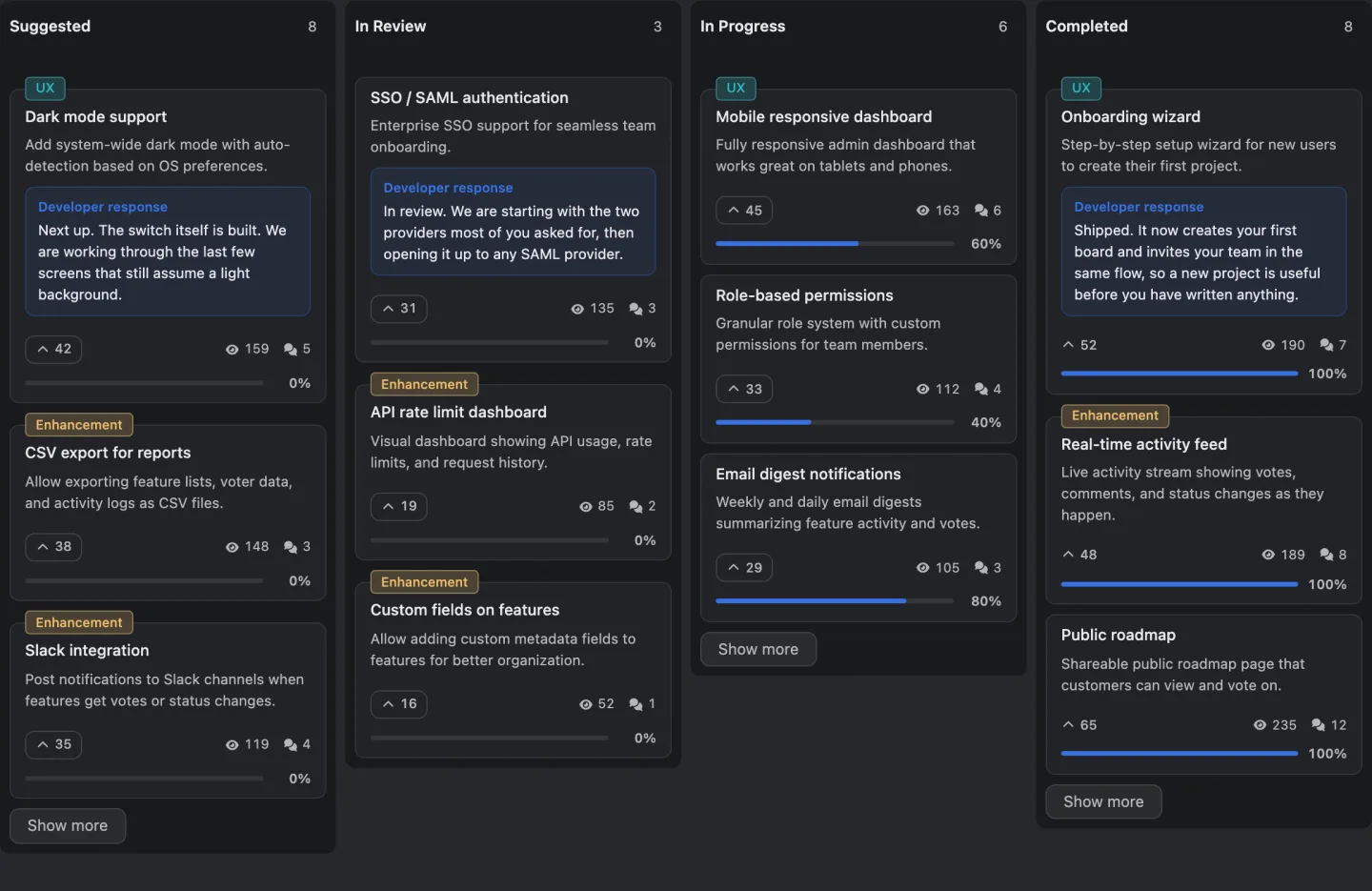
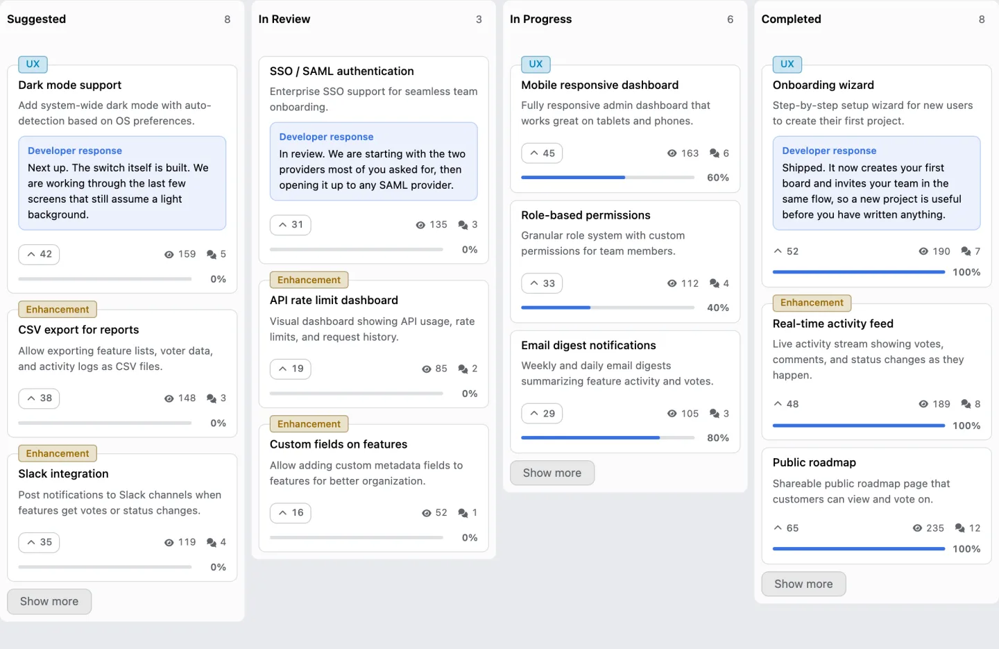
Can I just copy a form?
Yes. This one is plain HTML, it has no dependencies, and it will post to whatever you point it at.
<form method="post" action="/feedback">
  <label for="fb-title">What is the one thing you want changed</label>
  <input id="fb-title" name="title" type="text" maxlength="200" required
         placeholder="Search the board by the words in a request title">

  <label for="fb-detail">What is difficult, when does it happen, and what do you do instead today</label>
  <textarea id="fb-detail" name="detail" rows="6" maxlength="2000" required
            placeholder="Finding out whether something was already asked for means scrolling the whole list, which happens every time we prepare a release, so today we export to a spreadsheet and search there."></textarea>

  <label for="fb-email">Email, only if you want an answer</label>
  <input id="fb-email" name="email" type="email" autocomplete="email"
         placeholder="Optional">

  <p>
    A person reads every one of these. Nothing you write appears publicly until it has been read.
  </p>

  <button type="submit">Send</button>
</form>
Three things in it are doing real work and are worth keeping if you change the rest.
The label on the first field asks a question rather than naming a noun. Title is a filing instruction. What's the one thing you want changed is a prompt, and a prompt gets you a sentence instead of a fragment.
The placeholder on the second field is a whole worked answer, not a hint. It's longer than a placeholder usually is, on purpose, because showing somebody the shape of a good answer is the cheapest quality control there is.
The note above the button makes two promises and no more. Somebody reads it, and nothing is published without being read. Both are things you can actually keep.
How many forms should a product have?
One, in more places than you think.
The mistake is a separate form per surface, so the in app one asks four questions, the help centre one asks seven and the public board asks two, and three months later nobody can count anything because the three feed different tables.
One shape, reachable from the product, from the docs and from a public page, is worth more than three tuned ones.
The exception is the bug report, which genuinely is a different form because the fields are different. A request card holds the difficulty, when it happens and the workaround. A defect card holds what you did, what happened and what you expected.
Putting them in the same box produces a card that's half of each, and the argument for keeping them apart is here along with ten example cards ranked worst to best.
What does this cost to run?
Ours is nine dollars a month, and most of the cost isn't the money.
A form that works produces a queue, and a queue has to be worked. Requests you would have ignored quietly in an inbox are now visible, counted and waiting for an answer.
That obligation is real and several people who put a form up discover they didn't want it, which is a legitimate thing to discover.
If you're not ready for the queue, put up the smallest thing that still closes the loop. A page that says what's coming next, with no form on it at all, removes most of the routing work without adding an obligation. It's a smaller step and it's a real one.
14 days, a card at signup, then $9 or $39 a month.