The short version
- The shortest form that works is a title and a description.
- The title is the most important field, because it's what everybody else reads.
- The description is where the situation goes, and the situation is what makes a request buildable.
- Some fields look free and aren't. An email box on a public form is the main one.
What to put in a feedback form is two fields, in this order. A short title, then a description. Everything else is optional, and almost everything else costs you more replies than it returns.
This post goes through every field anybody puts on a feedback form, what it's for, what it costs, and whether to keep it. The answer is above and the reasoning is below, because the fields you drop are the decision, not the fields you keep.
What is the shortest form that still works?
A title and a description. That's the form our own board renders and it's not a minimalism pose. Each extra field is a decision the sender has to make while they still have the tab open.
There's a board with that form on it if you want to try filling it in, and the demo is open without an account.
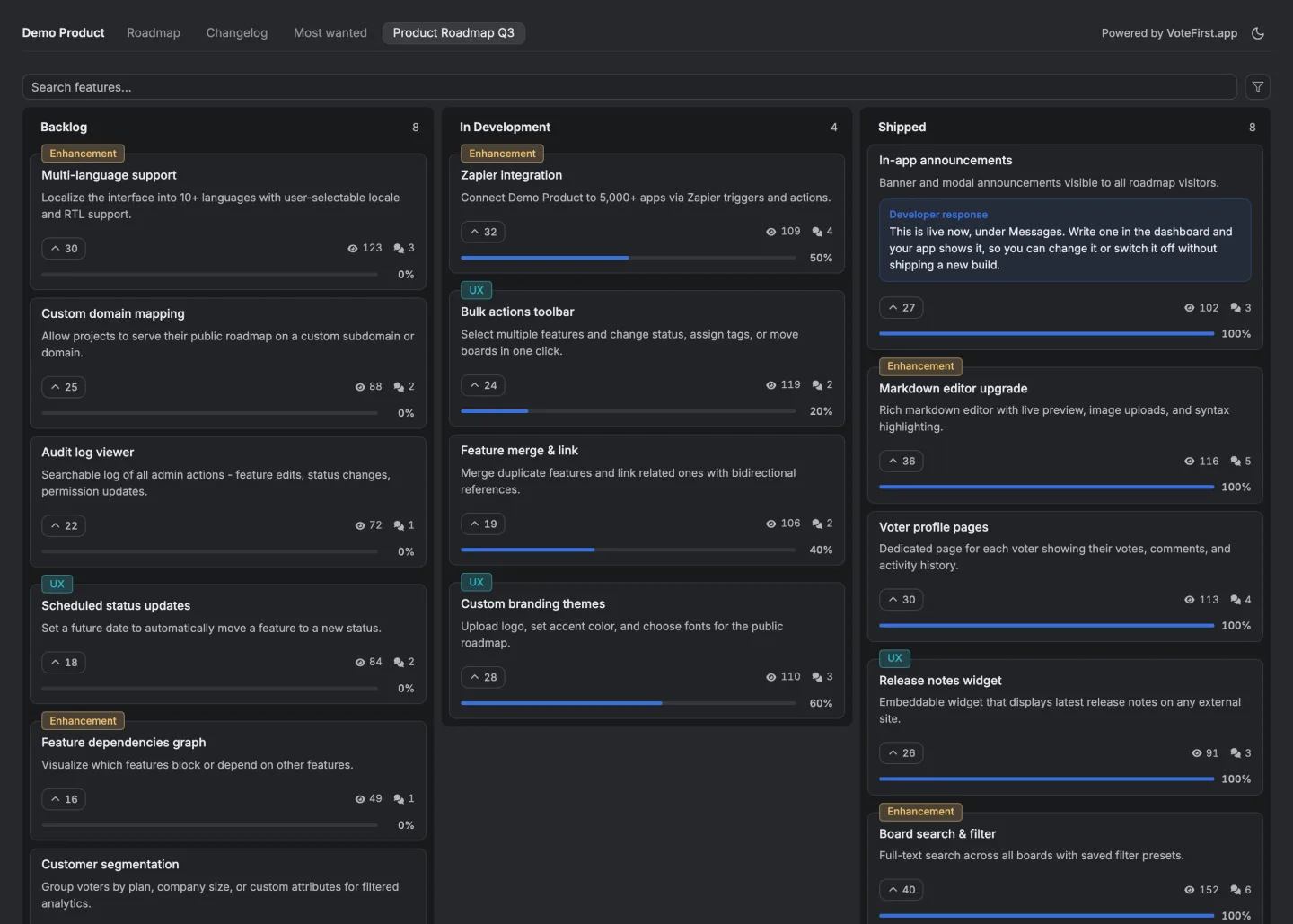
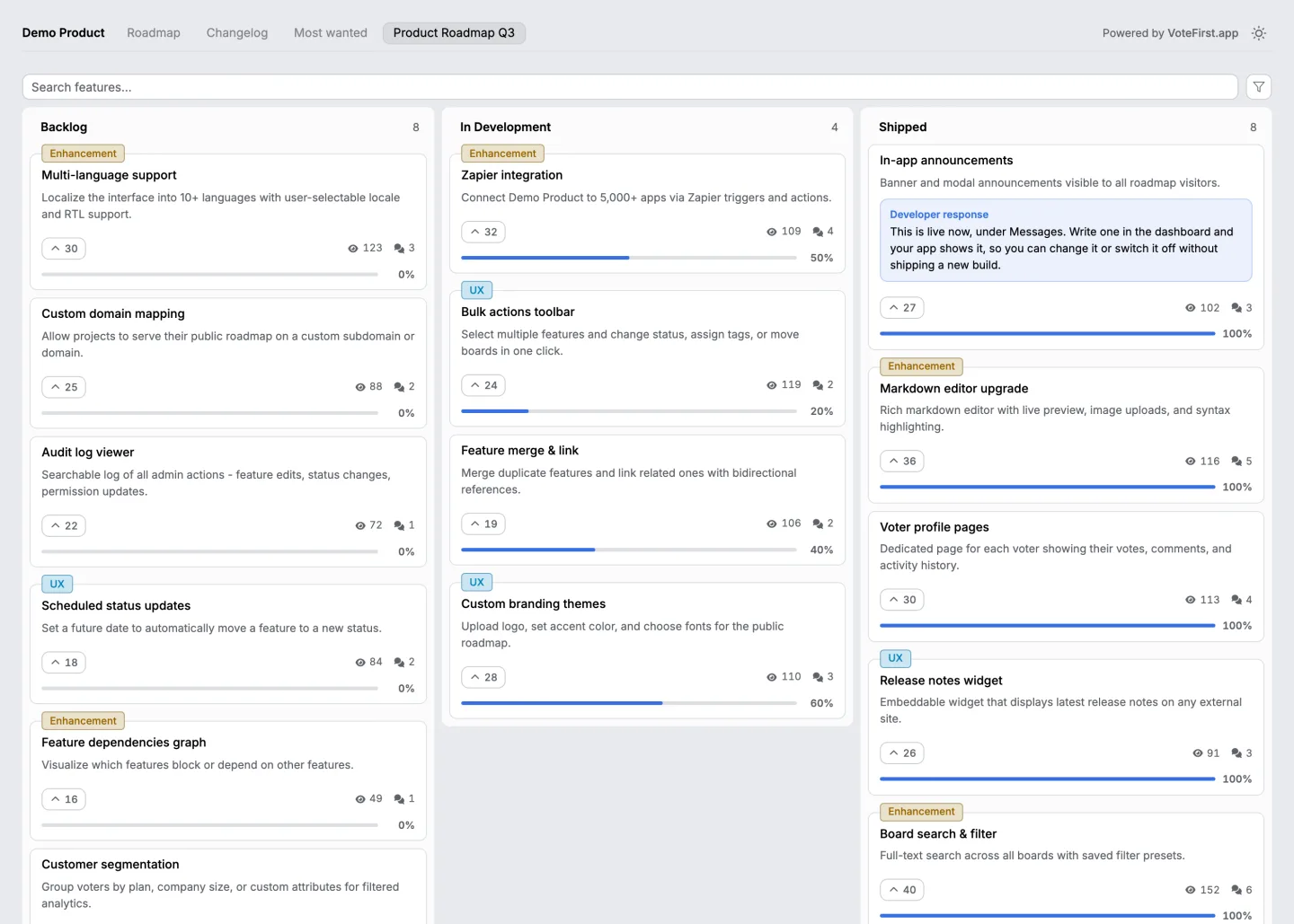
Want the form to feed a board people can vote on? Twenty eight feedback tools, the price and the unit each one bills on, read on one day.
Every field, and whether to keep it
| Field | What it is for | What it costs | Keep it? |
|---|---|---|---|
| Title | The one line that will appear in a list of fifty | Nothing. It is the only field that has to be there | Yes |
| Description | The situation, in the sender's words | Nothing, if it is not required to be long | Yes |
| Going back with the second question | A visible share of replies on a public form | Only if the form is private | |
| Name | Nothing you cannot get from the account | The same as email, for less | No |
| Category or tag | Sorting, in theory | The sender does not know your categories and picks Other | No. Tag it yourself |
| Priority or severity | Ordering, in theory | Everybody picks the top option | No |
| Product area | Routing | The sender guesses, and a wrong guess routes it away from you | No |
| Screenshot or attachment | Bug reports, genuinely useful | An upload is a whole extra decision and most people abandon it | Only on a bug form |
| Version or browser | Reproducing a bug | Nothing, if you fill it in from the session rather than asking | Yes, silently |
| A rating | A trend line | Nothing on its own, but it crowds out the sentence | Only with a follow up question in the same view |
| Consent checkbox | A legal requirement in some places | One more click | Only where you need it |
| "How did you hear about us" | A marketing question | Your reply rate, and it is not feedback | No |
The pattern across that table is this. Anything you can work out yourself should not be asked, and anything the sender can't answer accurately should not be offered.
The title field
The title is the whole form's most important field, because it's what everybody else reads. Fifty requests in a column are fifty titles.
Give it a length limit and keep the limit visible. Ours is 200 characters, which is about two lines on a card, and it forces a sentence, not a paragraph. A form with no limit gets titles that are the whole request, and a board of those is unreadable.
The placeholder does more work than the label. Ours says a short, descriptive title, and that's the only instruction most people will read.
The description field
This is where the situation goes, and the situation is the part that makes a request buildable.
Don't require length. A required minimum produces padding, and padding is worse than a short answer because it hides the request in the middle. Ours is capped at 2,000 characters and has no floor.
The placeholder is the only place you get to ask for the situation without adding a field. Something that says what you were doing when this came up outperforms a blank box, and it costs no extra decision.
The fields that look free and are not
Email on a public form. It feels free because it's one box. It's not. It changes the form from anonymous to identified in the sender's mind, and that's a different decision. On a private form it's the most valuable field there is, because it lets you ask the second question.
Category. It looks like it saves you sorting. It does the opposite, because now you've both an unsorted queue and a column of wrong labels to unpick.
Priority. The sender's priority is always high. It's high for them, which is true and useless for ordering.
The order to put them in
Title, then description, then anything you decided to keep. Never the other way around.
The reason is that people fill forms top down and abandon them somewhere in the middle. Whatever is first is the thing you'll get. If the first field is an email address on a public board, the thing you'll get is nothing.
What goes after the button
The form isn't finished at Submit. What happens next is the field nobody lists.
On our side the answer is a line in the form itself saying that the suggestion is reviewed by the project owner before it appears on the board.
It's there so that a sender who is about to write something isn't surprised by a delay afterwards, which is the moment people conclude the form is a void.
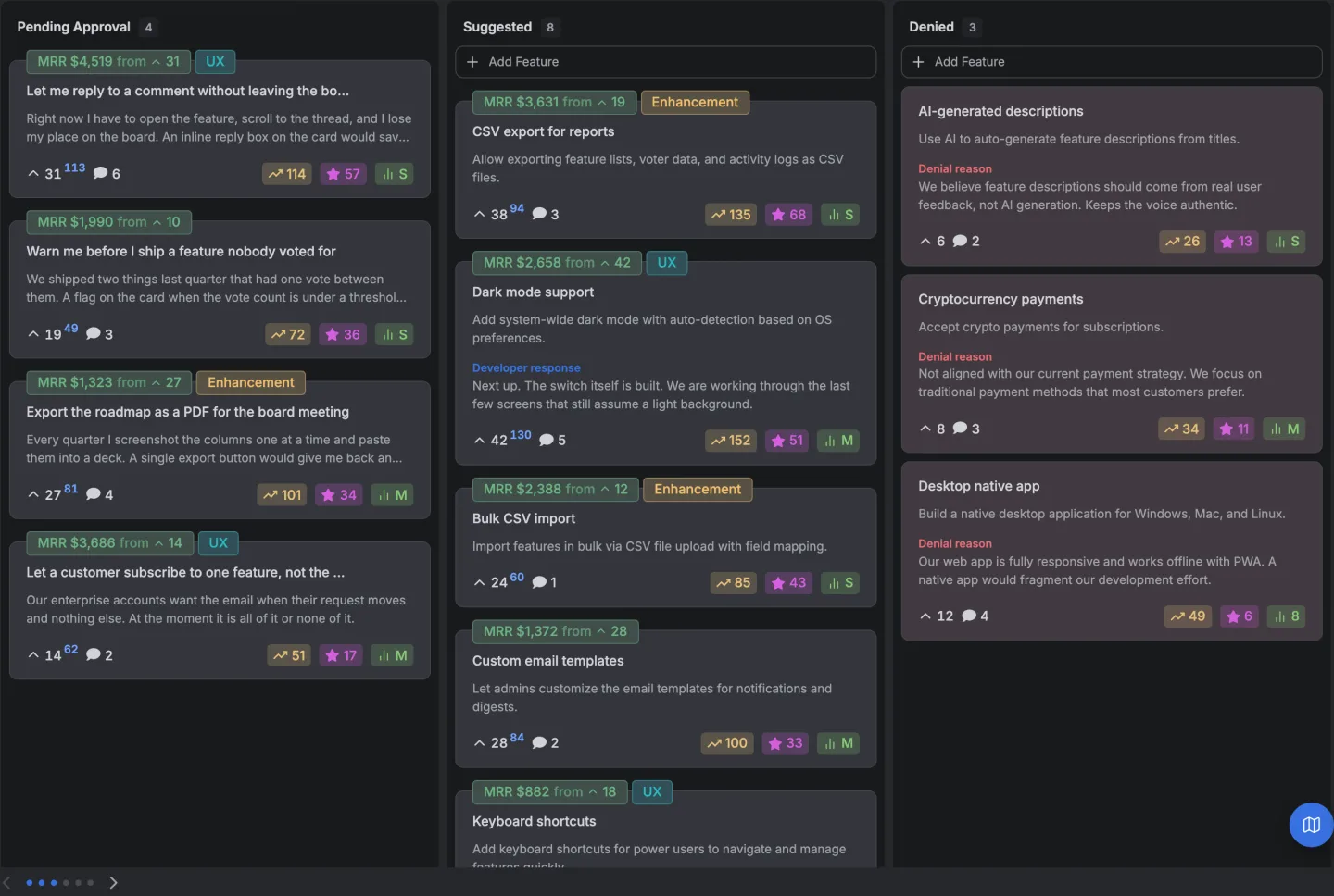
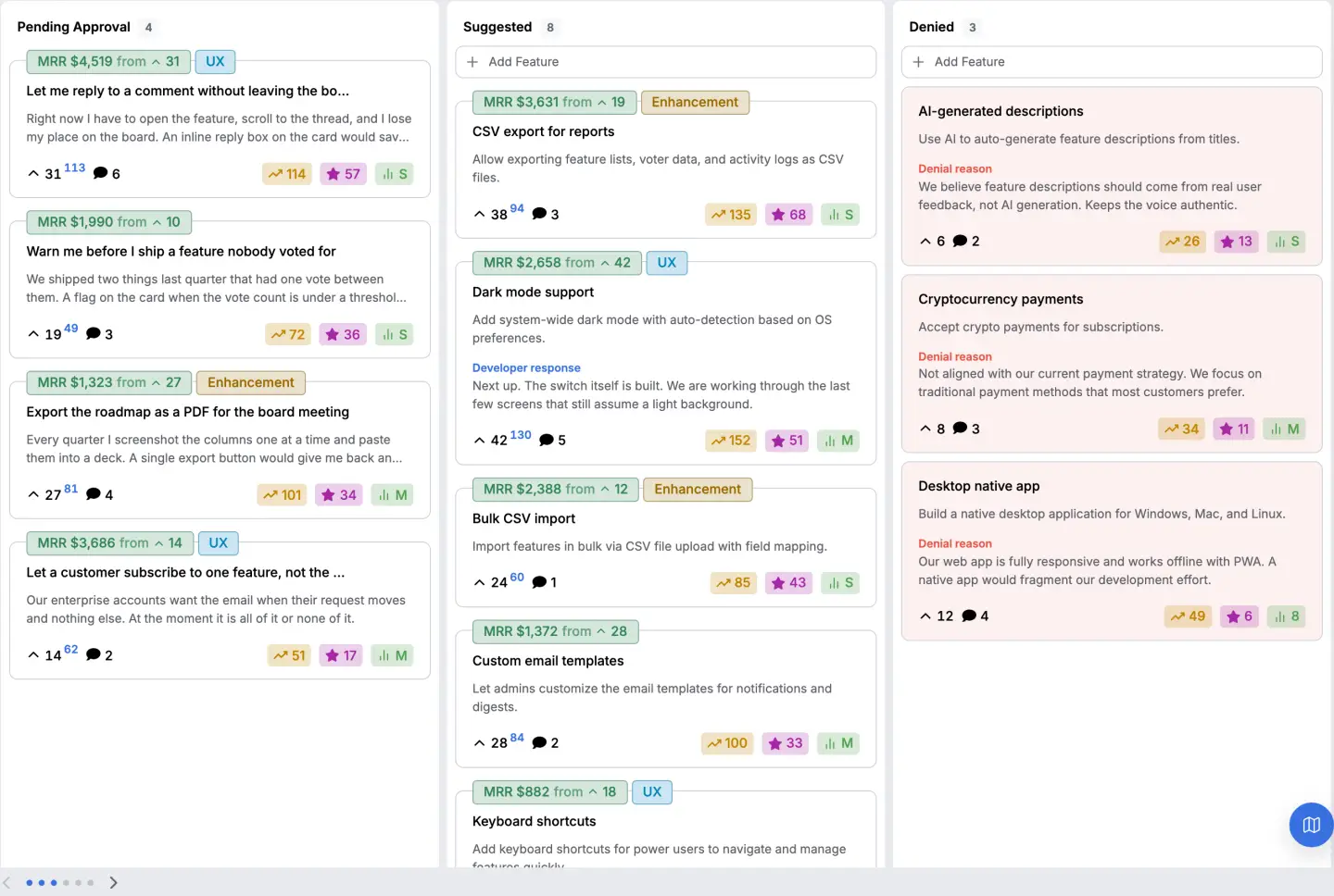
Once a request is up, the thing that keeps people writing is that it visibly becomes something. Other people agree with it, a thread forms under it, and its state changes.
How do you do this without a tool?
Any form builder does two fields into a shared inbox, and that's a real feedback form.
What you lose is the part after the button. The sender gets a thank you page and no way to see that anybody else asked for the same thing, so every message stays a separate message and the count you need never exists.
How does this product do it?
Two fields, the limits above, a line saying what happens next, and Cancel and Submit. Nothing a visitor writes appears publicly until somebody approves it. After that it's a card other people vote on, with its own comment thread, and the voters carry whatever you know about them.
The feedback board page has the rest, and what a feedback form is covers the four decisions underneath these fields.
How to write a feedback form covers the wording of each of the two fields.
14 days, a card at signup, then $9 or $39 a month.