The short version
- Four passes over one real request list, with what each pass can and can't prove.
- The pass that changes decisions is the one subtraction: where requests and votes disagree.
- Counts mean less than their size suggests, and that has to be said before anything is decided on them.
- You can run all four passes in a spreadsheet.
Most feedback analysis examples are invented lists with tidy categories. This one isn't invented. It's 177 requests taken from 36 live public feedback boards belonging to real companies, read on 27 August 2026, carrying 41,032 votes between them.
The analysis below is done by a script in this repository that prints its own rules, so every figure on this page can be reproduced. No request title appears anywhere on the page or in that output, because the titles belong to the boards they were posted on.
What is feedback analysis?
Turning a pile of individual messages into a small number of statements you can act on, and knowing what each statement cost you to make.
In practice it's four passes. Categorise, count, weight, and then look at what the categories left over. The fourth pass is the one that gets skipped, and it's where the interesting part usually is.
There's a request list open without an account if you would rather analyse a live one.
Want the counting done for you? Twenty eight feedback tools, the price and the unit each one bills on, read on one day.
Pass one, what are these requests about?
Nine keyword categories, applied to every title, first match wins.
| Category | Requests | Share of requests | Share of votes |
|---|---|---|---|
| Nothing that fits the other categories | 72 | 41% | 37% |
| Integration with another product | 29 | 16% | 13% |
| Display, sorting or filtering | 21 | 12% | 9% |
| Editing and content control | 13 | 7% | 15% |
| Bulk or repetitive work | 12 | 7% | 9% |
| Mobile or another platform | 11 | 6% | 8% |
| Import or export | 7 | 4% | 1% |
| Notification or reminder | 6 | 3% | 4% |
| Permissions and accounts | 6 | 3% | 4% |
The first row is the result. Forty one per cent of these requests fit none of the eight categories under it, and that's what every taxonomy of real feedback produces, not a failure of the categories.
A report showing a tidy nine way split has usually had a residual bucket quietly redistributed into the others, and once that happens the numbers are about the analyst, not the customers.
Pass two, what do the counts actually mean?
Less than their size suggests, and that has to be established before anything is decided on them.
Across the same 36 boards, the median request visible on page one had nine votes. On nineteen of them the median request had fewer than ten, and on eight of them fewer than five.
On the median board the most voted request held sixteen per cent of all the votes on page one, and the five most voted held about half.
So the head of a board is informative and the body of it's a list.
In the table above, a category with six requests and four per cent of votes is a rounding difference away from a category with seven, and treating those two as ranked is reading a signal that's not there. The measurement, with everything it can't tell you, is on its own page.
Pass three, where do requests and votes disagree?
This is the pass that changes decisions, and it takes one subtraction.
Two categories are worth more attention than their request count suggests. Editing and content control is seven per cent of requests and fifteen per cent of votes, so it's asked for rarely and wanted intensely. Mobile or another platform is six per cent of requests and eight per cent of votes, mildly the same way.
Two are worth less. Integration with another product is the biggest real category at sixteen per cent of requests but only thirteen per cent of votes, which is the classic shape of a long tail, many different integrations, each wanted by a few people, none of them the same integration. Import or export is four per cent of requests and one per cent of votes, the sharpest disagreement in the table.
That distinction is the whole value of the exercise. A roadmap built from the request counts would start with integrations. A roadmap built from the votes would start with editing. Neither is automatically right, but a team that never does this subtraction doesn't know it's choosing.
Pass four, what does the wording tell you?
Two findings, and both are about how people write rather than what they want.
Fourteen per cent of these requests are phrased as a solution rather than a situation. Twenty four of the 177 begin with add, allow, support, enable or similar. The rest name a thing rather than proposing a change, which is a better starting point than the advice about feedback usually assumes.
One request in 177 is worded as something being broken. The most voted items on a public board are wants, not defects. That's worth knowing before you decide a public board is where bug reports should live, because on these 36 boards they plainly don't.
What this analysis cannot tell you
Four limits, and they travel with every figure above.
Every count is page one of each board only, so all of them are floors. The boards order by prominence, not date, so the oldest visible post is a floor on staleness and never proof of anything.
The categories are keyword rules, not judgement, which is exactly why the residual bucket is the largest one. And twenty four probed hosts returned nothing at all, which can't be distinguished from an empty board, so they're excluded rather than counted as zero.
Analysis that doesn't carry its limits reads as more certain than it is, and certainty is the thing a pile of nine vote requests can't support.
How to do this on your own list without a tool
Export the list, put it in a sheet, and do the same four passes.
One column for the category, done by hand rather than by keyword, because a person reading 177 titles is better at this than any rule. One column for the votes. Then sort by category and compare the share of rows to the share of votes, which is the only arithmetic on this page that matters.
Then read the leftovers. Whatever your version of the forty one per cent turns out to be, it's the part nobody has thought about, and it's the reason to do the exercise at all.
What our own board gives the analysis
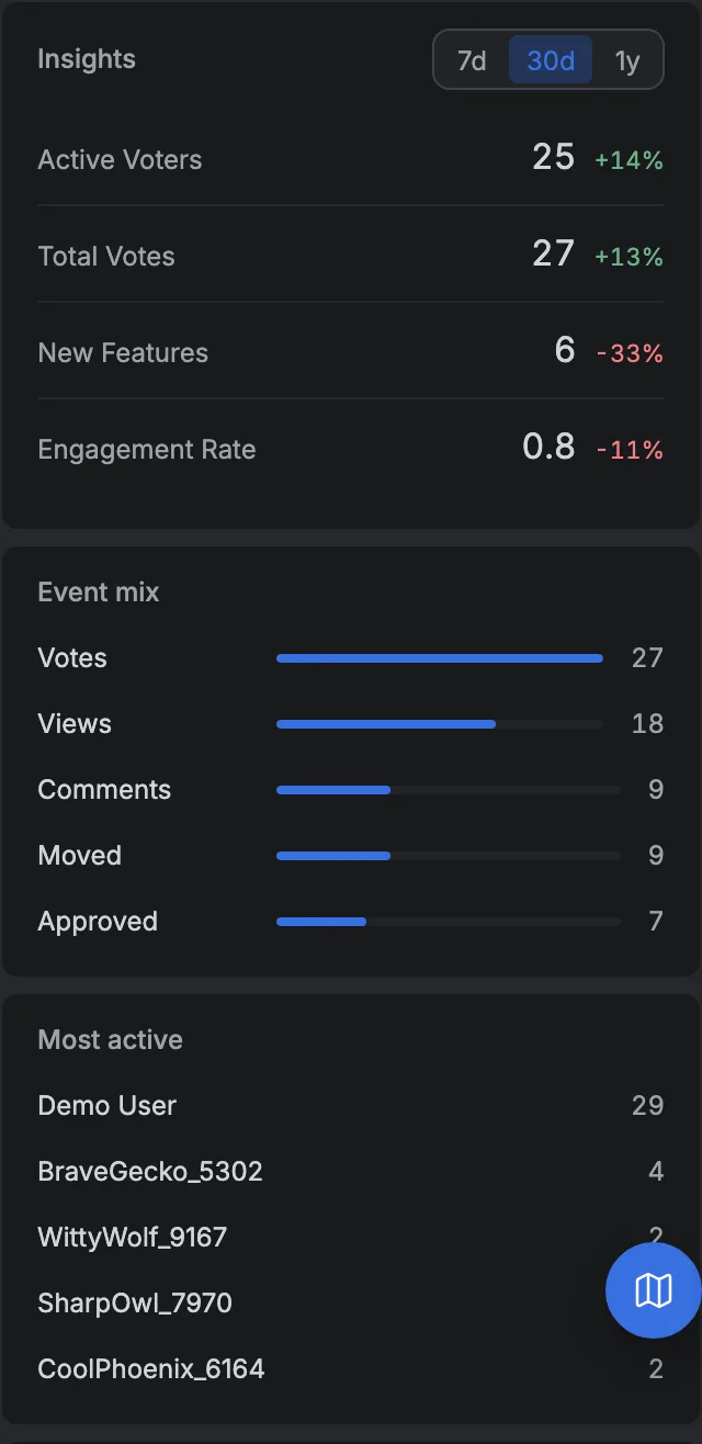
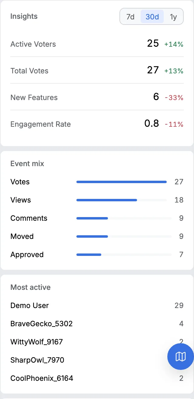
The counts are people, not messages, and each one has an address.
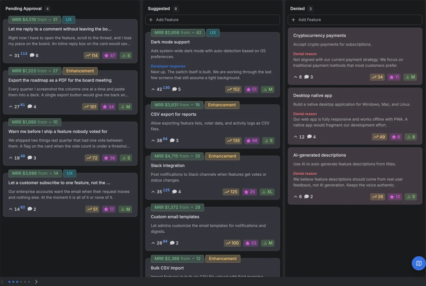
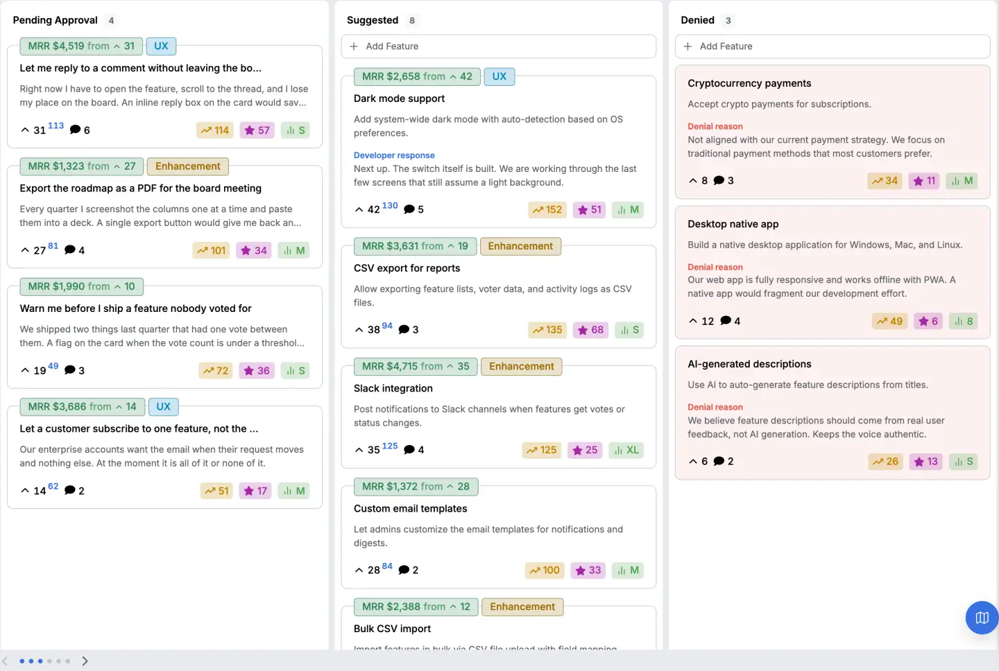
Because the voters are known, every request also carries a count weighted by what the people behind it pay. That turns pass three from a comparison of two numbers you've into a comparison of three, and the third one is the one that survives a forum link.
Everything that happened to the board sits on one timeline, which is where the dates in any analysis come from.
The limit is the same one the whole page carries. None of this manufactures a signal out of nine votes, and a board only ever hears from the people who turn up.
How the board is wired is written up here, and where this kind of material comes from in the first place has its own page.
14 days, a card at signup, then $9 or $39 a month.