The short version
- Five methods, run over the same twenty requests, and they don't agree.
- Use two of them and look at where they disagree. That gap is the decision.
- A request from somebody who doesn't pay is kept and answered, but doesn't set the order on its own.
- Every method fails somewhere. Knowing where beats knowing how it works.
How to prioritize feature requests comes down to one sentence. Pick a method, run it, then check whether it agrees with the other ones. If it does, the decision was never hard. If it doesn't, the disagreement is the actual information and the method you picked is the thing you should be arguing about.
Most articles on this subject explain four or five methods one after another and stop. That's the part that's easy to write and it's not the part that helps, because the methods aren't difficult to understand.
What's difficult is that they produce different answers on the same data, and nobody shows you that happening.
So this post runs five of them over one board of twenty requests and prints the queues side by side. The board is invented.
It's a plausible business software product with a mix of free and paying customers, and it exists so the arithmetic is visible, not described. Every number below comes out of one file and you can reproduce all of it.
What are the five methods?
Raw votes, RICE, MoSCoW, a weighted scoring model, and weighting each vote by what the person casting it pays.
Raw votes is a headcount. The request the most people asked for goes first.
RICE multiplies reach by impact by confidence and divides by effort. Reach is how many accounts it touches in a quarter, impact is a coefficient on a fixed scale, confidence is your honesty about the first two, and effort is person months.
MoSCoW sorts everything into Must, Should, Could and Won't. It's the only one of the five that produces no number and therefore no order inside a bucket.
A weighted scoring model is a sheet where you name the things you care about, give each a weight, score every request against each one, and add it up. In the sheet below the weights are demand thirty percent, revenue thirty five percent, strategic fit twenty percent and cost fifteen percent.
Revenue weighting multiplies each vote by a number attached to the person who cast it. On this board the tiers are free at one, team at four and enterprise at twenty. Those numbers are a choice the team made rather than a default, and choosing them is most of the work.
If you would rather see it than read about it, the demo board is open with no account and no email.
Doing this in a tool rather than a spreadsheet? Twenty one feature request tools and the eight units they bill on. The unit decides the bill, not the headline price.
What does the board look like?
Twenty requests, two hundred and fifty seven voters, and a very uneven distribution of money behind them.
| Request | Votes | Revenue weighted | RICE | Weighted score |
|---|---|---|---|---|
| Dark mode | 31 | 37 | 200 | 63.7 |
| Mobile app | 27 | 33 | 31 | 49.7 |
| Emoji reactions | 25 | 25 | 230 | 54.1 |
| Comment threads | 23 | 29 | 140 | 56.2 |
| Keyboard shortcuts | 21 | 24 | 150 | 49.7 |
| Saved filters | 19 | 25 | 280 | 51.3 |
| Chat notifications | 18 | 30 | 208 | 56.7 |
| Export to PDF | 16 | 19 | 210 | 42.5 |
| Zapier integration | 14 | 26 | 72 | 49.1 |
| Public API v2 | 11 | 61 | 36 | 67.0 |
| Bulk CSV import | 9 | 56 | 64 | 64.3 |
| Role based permissions | 8 | 74 | 30 | 72.1 |
| Custom domains | 7 | 35 | 37 | 51.5 |
| Two factor authentication | 6 | 50 | 40 | 61.6 |
| Webhooks | 6 | 34 | 30 | 49.1 |
| Scheduled reports | 5 | 30 | 20 | 40.2 |
| SAML single sign on | 4 | 64 | 7 | 61.6 |
| Audit log | 3 | 44 | 9 | 51.0 |
| Data residency in the EU | 2 | 40 | 2 | 40.6 |
| SSO provisioning with SCIM | 2 | 40 | 2 | 42.5 |
Read the top row and the bottom rows together, because that's the shape of every board like this one. Dark mode has thirty one voters, which is twelve percent of everybody who voted on anything.
It carries thirty seven of the seven hundred and seventy six weighted points, which is under five percent. SAML single sign on has four voters and sixty four points.
What do you do with a request from someone who does not pay?
You keep it, you answer it, and you don't let it set the order on its own.
That sounds like a compromise and it's actually the measurement. On the board above, the five requests with the most voters carry a hundred and twenty seven of the two hundred and fifty seven votes, which is just under half the people who voted on anything.
Those same five carry a hundred and forty eight of the seven hundred and seventy six weighted points, which is under a fifth of the weight behind them.
The five with the fewest voters run the other way. Sixteen votes between them, six percent of the people, and two hundred and eighteen weighted points, which is twenty eight percent. SAML single sign on has four voters and sixty four points. Dark mode has thirty one voters and thirty seven.
So the free tier is neither noise nor the plan. Treat it as the fastest and cheapest description of what's wrong with the product, gathered from people who owe you nothing, and as a bad guide to what the next quarter should contain, because the people paying for that quarter aren't in it.
The practical answer is two numbers on the same card, not one. A board that shows only the headcount builds dark mode. A board that shows only the money builds SAML and quietly stops being a place anybody wants to post.
Keeping both visible is what the weighted board is for, and the argument between them is the decision rather than an obstacle to it.
One thing worth saying plainly. A request from somebody who doesn't pay is still worth a reply. The reply is free, it's the whole reason the person posted in public rather than churning in silence, and nothing above is an argument for ignoring it.
Do the five methods agree?
No. Two of them share a first place and the other two each pick something different.
| Method | Its top five, in order |
|---|---|
| Raw votes | Dark mode, Mobile app, Emoji reactions, Comment threads, Keyboard shortcuts |
| Revenue weighted | Role based permissions, SAML single sign on, Public API v2, Bulk CSV import, Two factor authentication |
| RICE | Saved filters, Emoji reactions, Export to PDF, Chat notifications, Dark mode |
| Weighted scoring | Role based permissions, Public API v2, Bulk CSV import, Dark mode, Two factor authentication |
The row worth staring at is the first two. The top five by votes and the top five by revenue have nothing in common at all. Not one request appears in both. Same board, same day, same twenty requests, and the two queues don't touch.
That's what happens whenever the people who ask loudest aren't the people who pay most, rather than a quirk of the numbers chosen here, which on a product with a free tier is nearly always.
RICE picks a third answer again, because it's measuring something the other two aren't. Saved filters wins it on two hundred and eighty, a long way clear, because it's cheap and touches a lot of accounts. Nothing about the money enters the formula at any point.
When does each one fail?
Every method here fails somewhere, and knowing where is more useful than knowing how it works.
Raw votes fails when your customers are worth different amounts. It's the correct tool when they're not. A community board, an open source project, an internal tool where everybody is a colleague, all of those should count heads and stop. It fails the moment one voter is worth forty of another, because a headcount can't record that and never tried to.
RICE fails on confidence. Three of its four inputs are estimates you produce yourself, and the fourth is a guess about how good the first three are. It looks like arithmetic and most of it's opinion with a number typed next to it. It also has no idea who anybody is. On the board above it puts emoji reactions second, because emoji reactions are cheap and touch everybody, and no part of the formula can notice that no paying customer asked for them.
MoSCoW fails by inflation. On this board the team put seven of the twenty into Must, which is twenty one and a half person months of work inside the bucket named non negotiable, out of forty seven and a half across the whole list. Seven Musts with no order between them isn't a prioritization, it's the same argument again with better labels on it. The method has no defence against this because nothing in it costs anything to say yes to.
Weighted scoring fails on the weights. The output is entirely determined by numbers somebody chose in a meeting, and those numbers are never revisited. Move revenue from thirty five percent to twenty and dark mode moves up. The sheet gives an answer that looks objective and is a record of one afternoon's opinion.
Revenue weighting fails when it's the only thing you look at. Follow it strictly on this board and you build role based permissions, SAML, an API and SCIM, which is a quarter of enterprise plumbing and nothing at all for the hundred and ninety six people on the free tier who are where your next enterprise customers come from. It also fails when your revenue data is wrong, and revenue data is usually a little wrong.
Which one should you actually use?
Two of them, and then look at where they disagree.
Run the headcount and run something that knows about money. Put the two queues next to each other. Anything near the top of both is a decision you don't need to spend a meeting on, and there's usually one or two.
On the board above there are none, which is itself the finding, because it says this product is being pulled in two directions and somebody has to say out loud which one wins this quarter.
The requests that appear high on one list and low on the other are the entire agenda. Dark mode at thirty one votes and thirty seven points is the free tier asking.
Role based permissions at eight votes and seventy four points is the money asking. Both are real. A method that hands you one number has quietly made that choice for you and not told you.
Are these the same as prioritization techniques?
Yes. Technique, method and framework are three words for the same thing, and the five above are the ones a feedback board can run without asking you to invent numbers.
The ones people search for that aren't in the five sit one level up from a board, because they need an estimate, not a vote. The Kano model sorts features by how satisfaction responds to them, which takes a survey rather than a queue.
Cost of delay prices the wait rather than the work, and it needs a revenue figure per feature that almost nobody has. The full list of what the word covers is in the glossary entry.
None of those replaces the exercise above. They decide what a request is worth, and the five methods above decide what order the requests you already have go in, which is the question a board actually asks you every week.
Can you do this in a spreadsheet?
Yes, and for a first product you should.
Four columns get you most of the way. The request, the number of votes, the total revenue of the accounts that voted, and your effort estimate. Sort by column two, screenshot it. Sort by column three, screenshot it. The two screenshots are the conversation.
The spreadsheet breaks in a specific place, not gradually. It breaks when the votes stop arriving in a form you can paste. As long as feedback comes to you in email and support tickets and you're the one typing it into rows, a sheet is fine and a tool is overhead.
When a customer votes on something themselves, the sheet is now a copy of a system somewhere else and it's out of date the moment you close it.
The second break is slower and worse. A sheet records that eight accounts wanted role based permissions. It doesn't record which eight, so when the feature ships you can't tell those eight.
The list of who asked is the thing that makes a release note worth sending, and a spreadsheet throws it away by design.
How does a tool change it?
It removes the typing and it keeps the identity attached to the vote.
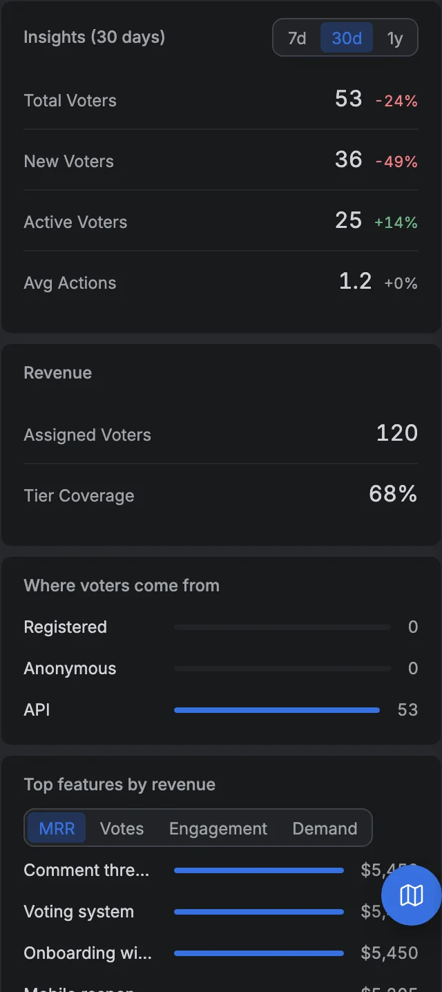
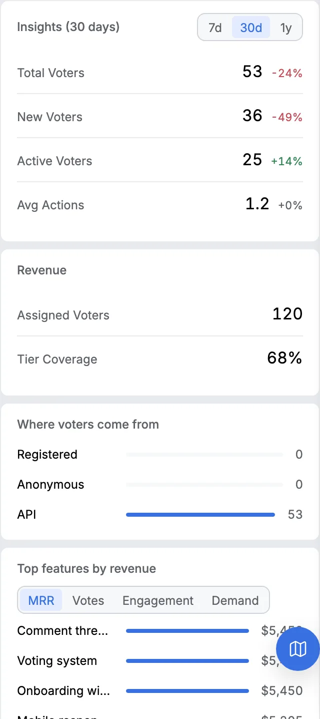
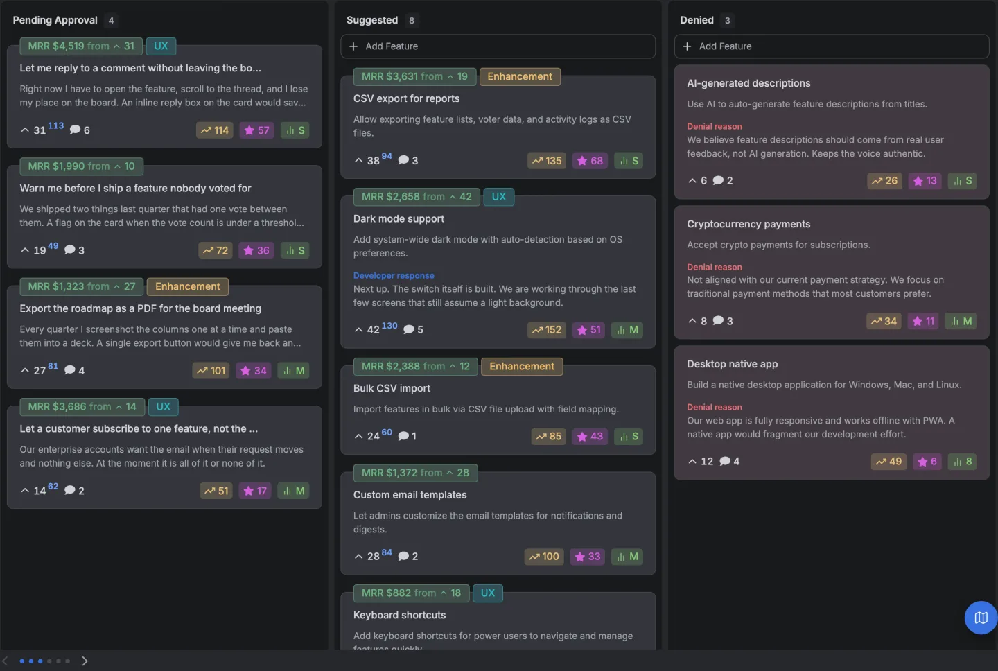
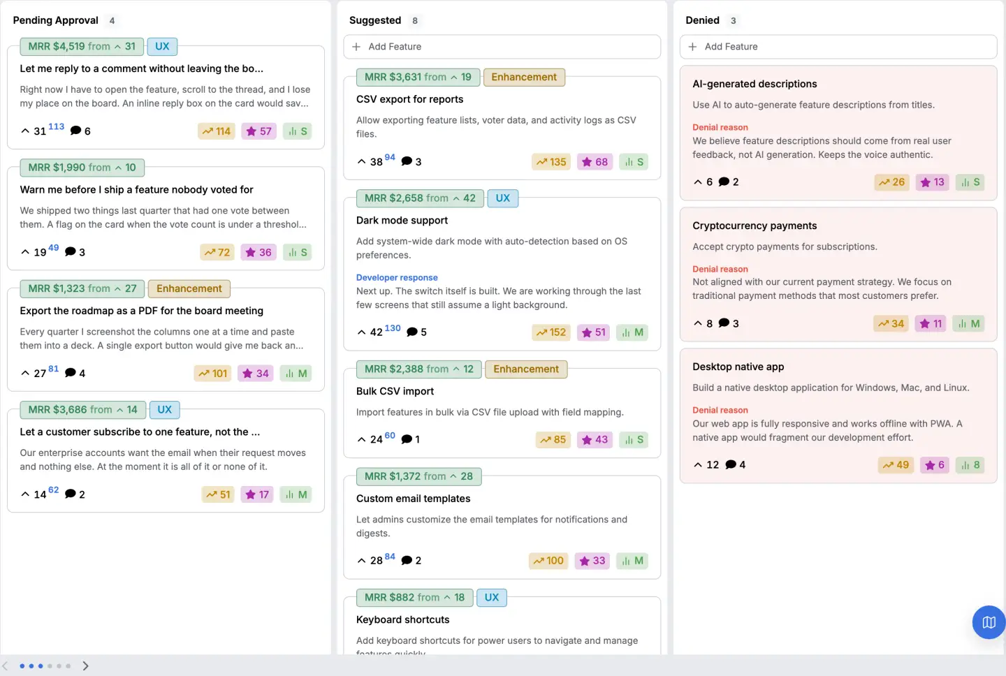
On VoteFirst the tier multiplier is written onto each vote at the moment it's cast, so the weighted total and the plain headcount are both live on the same card and you never run the sheet again. The mechanism is here, including what it doesn't do.
The part worth being precise about is that the plain count never goes away. Both numbers sit on the card together, because the disagreement between them is the information and a product that showed you only the weighted number would be making the same mistake as a product that shows you only the headcount.
The board it sits on puts the vote count on every card and lets anybody vote without an account, which matters here because a board only tells you about the people who reached it.
If you want the shape of the argument in a category rather than in a method, every tool we could price is on one page and seven of the twenty one offer some form of revenue weighting.
The argument here's that you should run two methods, not one, and the feature is common enough that this isn't an advertisement for a rare one.
14 days, a card at signup, then $9 or $39 a month.